Introduction
Data visualization is a powerful tool that allows us to use data to tell an engaging story. The narrative we present is enhanced by our data, especially when it is easily accessible and intuitive to understand. This is evident by the large amount of data visualization tools and galleries available throughout the internet. For example, Tableau Software hosts a data viz gallery that allows users to post their creations using their software. However, for most users, Microsoft Excel is the first tool they are exposed to when it comes to developing data visualizations for their business, school, and social projects.
Creating data visualization has its caveats. Improper data visualization can mislead, distort, and “lie,” which can result in poor decisions, loss of profit, and regret. In this blog, we will explore two of the most common distortion techniques that violate Tufte’s principles of graphical integrity: Truncated Axis and Area as Quantity.[1]
Motivating example
We will use data from the Medical Expenditures Panel Survey, which is a large-scale survey of households on health care resource use and spending in the United States. We will compare insurance status (Private, Public, Uninsured) between genders, which is summarized in Table 1. We will use Microsoft Excel to generate all our examples.

Distortions
Data visualization has opened the door to increased misrepresentation of numbers. Interest groups and advocates will distort the data visualization to try and mislead or convince their audience of their arguments or narrative. Such techniques include using truncating axes and disproportionate sizes.
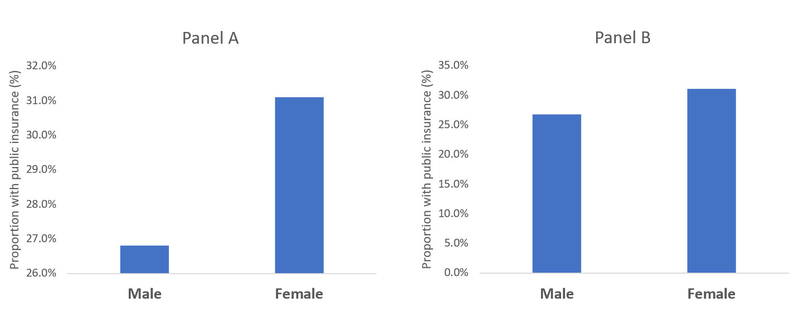
Let’s compare the difference in the proportion of males with public insurance to females with public insurance. In Figure 1, a bar chart is used to compare the proportion of males and females with access to public insurance. In Panel A, a truncated y-axis is used to distort the difference in the proportion of males and females with public insurance. The absolute difference is approximately 4%. However, Panel B, which uses a non-truncated y-axis, the perceived difference is not as great as that appearing in Panel A, despite having an absolute difference of 4%. Our mind perceives Panel A as having a greater difference; however, Panel B shows the same absolute difference of 4%, but does not illicit the same perception. This is supported by a study performed by Pandey and colleagues who reported that respondents rated the truncated bar chart as having a greater difference than the non-truncated bar chart.[2] It is our recommendation that a non-truncated y-axis is used when presenting data as a bar chart.
Figure 1. Comparisons of bar charts using a truncated y-axis (A) and a full y-axis (B).
Another distortion technique uses disproportionate sizes or “Area and Quantity” method. With this distortion, the values or quantitative data is not proportional to the area that represents it. Tufte argues that “the representation of numbers, as physically measured on the surface of the graph itself, should be directly proportional to the numerical quantities represented.”[1] In order words, the area used to represent the values or quantitative data should not be grossly exaggerated. Figure 2 illustrates how this principle is violated.
Figure 2. Proportion of males and females with public insurance using improper Area as Quantity.
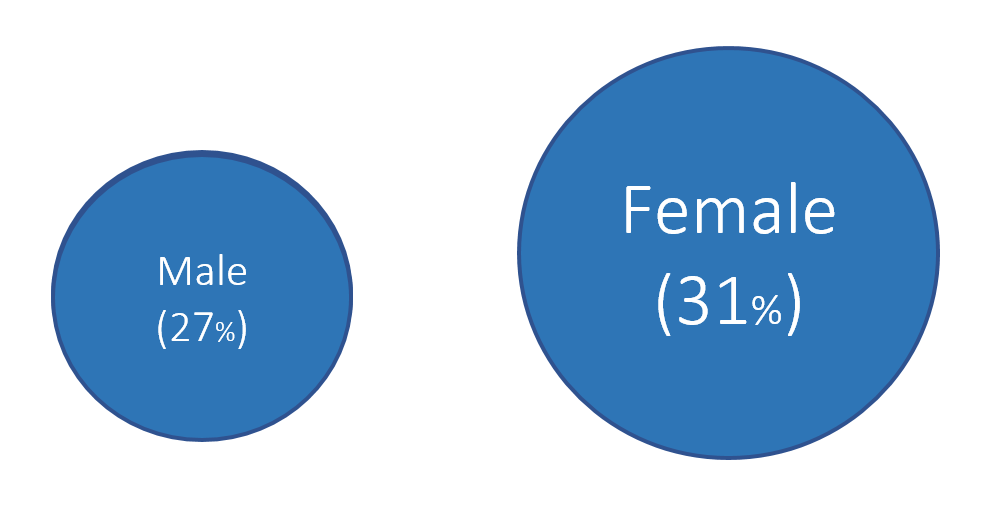
In Figure 2, 27% of males have public insurance versus 31% of females. In terms of relative difference, females have a 15% greater proportion with public insurance compared to males per the equation: .
However, the area in Figure 2 has females with an area that is 96% greater than males, which is not reflective of the relative difference of 15%.
Figure 3 illustrates the correct Area as Quantity that reflect the relative difference between males and females with public insurance. We estimated the area of the circle for males and females and properly adjusted the sizes to reflect their relative differences. Now, the relative difference is not as great as previously illustrated. Instead, we have an accurate representation of the relative difference in having public insurance between males and females. We recommend estimated the area of a shape to reflect the relative difference between the groups with these types of data visualizations.
Figure 3. Proportion of males and females with public insurance using the proper Area as Quantity.

Conclusions
Distortions can mislead or convince an audience of a narrative that do not reflect the actual data. Developing data visualization that provides empirical support for your narrative should be accurate and honest. Fortunately, innocent mistakes like the examples above are easy to correct, especially when using programs like Microsoft Excel.
Notes
We calculated the area of the circle using Archimedes method where Area = pr^2 where p is the constant (p=3.14) and r is the radius of the circle.
References
1. Tufte ER. The Visual Display of Quantitative Information. Second. Cheshire, CT: Graphics Press, LLC.; 2001.
2. Pandey AV, Rall K, Satterthwaite ML, Nov O, Bertini E. How Deceptive Are Deceptive Visualizations?: An Empirical Analysis of Common Distortion Techniques [Internet]. In: Proceedings of the 33rd Annual ACM Conference on Human Factors in Computing Systems. New York, NY, USA: ACM; 2015. p. 1469–1478.Available from: http://doi.acm.org/10.1145/2702123.2702608