BACKGROUND
Visualizing change across two time points allows your audience to see the impact of a program’s impact. In a previous article, I demonstrated how you can use slope graphs to illustrate changes across two time points. However, there is a risk of the slope graphs becoming a tangled mess (or spaghetti plot) if too many comparisons are being made. An easier way to illustrated changes cross two time points for a large number of groups is with a Cleveland dot plot (or lollipop plot).
By using a horizontal line between two points arranged from most change to least change, your audience can quickly visualize the program’s impact and rank them according to the subject or group.
MOTIVATING EXAMPLE
We will continue to use the state-level drug overdose mortality data from the CDC.
https://www.cdc.gov/drugoverdose/data/statedeaths.html
Mortality rate is presented as the number of deaths per 100,000 population.
In a previous tutorial, we only looked at eight different states. In this tutorial, we will illustrate a change in all 50 states onto a single plot using a Cleveland plot.
Here is the data setup in Excel:
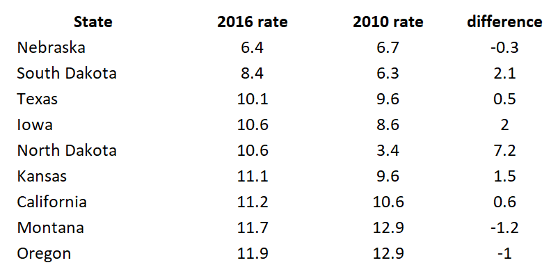
The difference is calculated as the difference in mortality rates between 2016 and 2010.
In Excel, select the first two rows (State and 2016 rate) and generate a horizontal bar chart. Make sure to sort the order of the 2016 rate from least to greatest.

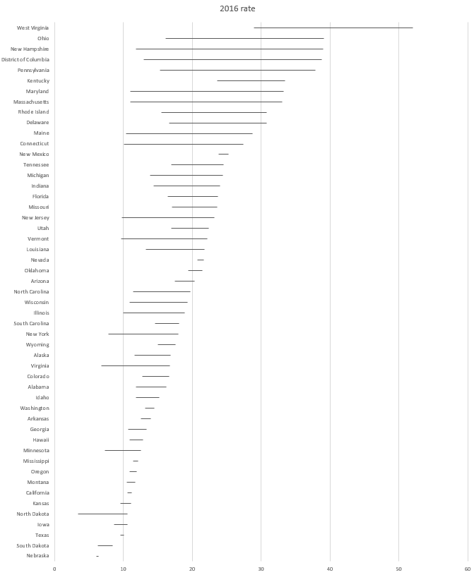
The horizontal bar chart should look like the following:

After you created the horizontal bar plot, you will need to add error bars. Select the Design tab > Add Chart Elements > Error Bars > More Error Bars Options:

In the Format Error Bars options, make sure to check Minus under Directions, No Cap under End Style, and Custom under Error Amount:

Click Specify Value and then select the differences column for the Negative Error Value:

On the bar chart, select the bars and then under the Format

The horizontal bar chart should have the fill remove and the error bars present and should look like the following:
Select the error bar and go to the Format Error Bars option. Under the Joint type select Round and under the Begin Arrow Size select the Oval Arrow. This will add a circle on the one end of the error bar.

You can also increase the size of the Oval Arrow by selecting a larger size from the Begin Arrow Size drop down.
After selecting the Oval Arrow for the Join Type and the Begin Arrow Type, your chart should look like the following:

The next steps will require you to add a second data series. Right-click on the chart area and select the 2010 mortality rates.

After selecting the data, make sure to map the Horizontal Axis Labels to the corresponding states.

Your chart should now include the second data series (2010 mortality rates) as horizontal bars.

In the next steps, you will add error bars to the 2010 mortality horizontal bars (similar to the error bars for the 2010 mortality rates data). Instead of adding error bars for the Minus, you will add error bars for the Plus.

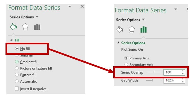
Similar to the 2016 mortality rates data, you will remove the horizontal bars by selecting No fill and then setting the Series Overlap to 100%
Select the error bars and then change the Begin Arrow Type to Oval and increase the size.

Your chart should now include two dots with lines between them for each state.

After a few more adjustments to the dot size and colors, the final Cleveland plot can look like the following:
Figure 1. Cleveland plot comparing the drug overdose mortality rates between 2010 and 2016.

The dots give us a good illustration of the magnitude of change in the drug overdose mortality rates between 2010 and 2016. Additionally, using the colored fonts help to map the drug overdose mortality values with the dots. For example, West Virginia had the highest drug overdose mortality rate in 2016 (blue dot) and a large increase in drug overdose mortality rates between 2010 (red dot) to 2016. Nebraska has the lowest drug overdose mortality rate in 2016 (blue dot) among the states, which was lower than in 2010 (red dot).
CONCLUSIONS
Cleveland plots can illustrate the change in drug overdose mortality rates between two time points for multiple groups without cluttering the chart space. Unlike slope graphs which can be difficult to distinguish between states, the Cleveland plot separates each state into their own rows allowing for a simple estimation of change across two time points. Moreover, it is also easier to see the magnitude in change in between 2010 and 2016. We recommend using Cleveland plots when you have a lot of groups (e.g., states) with an outcome that changes across two time points (2010 and 2016).
REFERENCES
I used the following websites to help develop this tutorial.
http://stephanieevergreen.com/lollipop/
https://policyviz.com/2016/02/04/lollipop_graph_in_excel/
https://zebrabi.com/lollipop-charts-excel/
https://peltiertech.com/dot-plots-microsoft-excel/
The following video provides step-by-step instructions in making a horizontal lollipop chart:
https://www.youtube.com/watch?v=tHa8eEb-LTg
The following website provides examples of lollipop charts:
https://www.r-graph-gallery.com/lollipop-plot/