BACKGROUND
Suppose you wanted to show a change across two periods in time for several groups. How would you do that? One of the best data visualizations for this is the slope graph. In this tutorial, we’ll show you how to create a slope graph in Excel and highlight a state using contrasting colors.
MOTIVATING EXAMPLE
We will use the state-level drug overdose mortality data from the CDC.
https://www.cdc.gov/drugoverdose/data/statedeaths.html
Here is a sample of set of data from the CDC:

Each value is a rate for the number of deaths per 100,000 population.
In Excel, select the three columns (State, 2010 rate, and 2016 rate).

Go to Insert Chart and select Line with Markers.

The chart should look like the following:

Right-click anywhere on the chart and click Select Date and then click on the Switch Row/Column.

The Y and X axes should switch places and the chart should look like the following:

Delete the Chart title, legend, and Y-axis.
Right-click on the X-axis and select Format Axis. Then select “On tick marks.”

This will move the lines to the edges of the chart.

Now, we want to add labels to the ends of each line. Right click on one of the lines and select Add Data Labels. Then select the left data label and format it according to the following guide:

Do the same thing for the right label, but make sure to use the right label position. Bring both ends of the chart closer to the middle to give your data labels room to expand (otherwise, the state will stack on top of the value, which you do not want). The chart should look like the following:
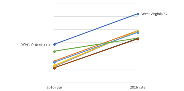
Finally, you can format the figure using different colors and removing the excess gridlines. Try to experiment with different shades of color to generate the desired effect. In our example, we wanted to highlight West Virginia from the rest of the other states.
Here is what the slope graph looks like after some tweaking and adjustments:

In the above slope graph, West Virginia was highlighted using a cranberry color to give it a greater contrast to the lighter grey of the other states. You could use this method to highlight other states of interest such as New Hampshire or the District of Columbia, which had greater percentage increases between 2010 and 2016.
In the final slope graph, we highlight West Virginia and New Hampshire in different colors to distinguish them from the other states.

CONCLUSIONS
Using slope graphs can show simple trends across two periods in time. More complex slope graphs can have multiple time points and more states. In our simple example, we highlight the key steps to generate a slope graph in Excel. Using colors to highlight certain states can make a simple slope graph more visually appealing and assist the eyes in identifying the states that are important according to the data.
REFERENCES
Knaflic, CN. Storytelling with Data. 2015. John Wiley & Sons, Inc., Hoboken, New Jersey.