MULTI-DIMENSIONAL DATA VISUALIZATIONS
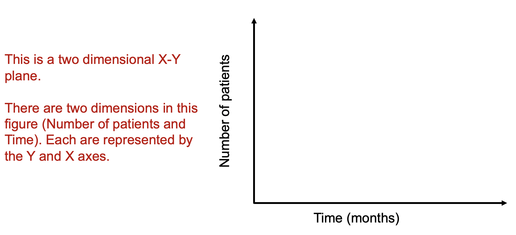
Data visualizations can improve how we see complex data, in particular, where multiple dimensions are involved. For instance, in an X-Y plan, we can have the months on the X-axis and the number of patients on the Y-axis (Figure 1). Let’s imagine that number of patients represents some outcome you are interested in (e.g., number of patients who has 5+ prescription medications). Time and the number of patients are dimensions on this two dimensional plan.
Figure 1. Two-dimensional X-Y axes figure.
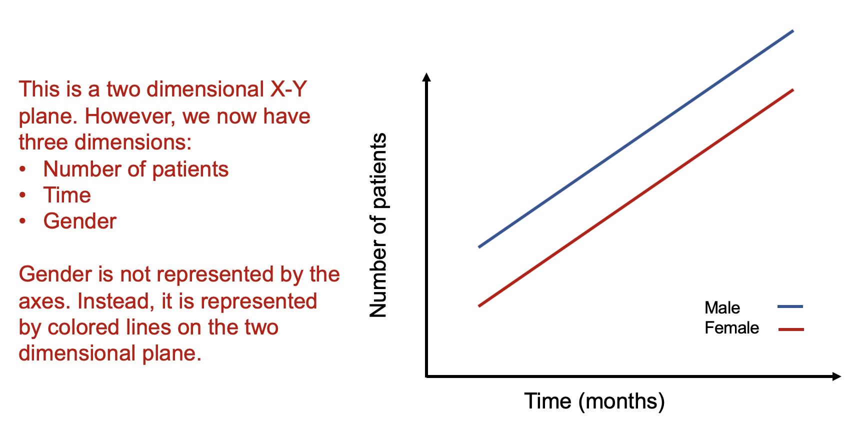
As a rule, whenever you want to display multiple dimensions, each dimension needs to be represented onto a single figure, which is challenging given that a figure is normally on a two-dimensional plane. What if we wanted to have a figure with more than two dimensions? What if we wanted to have a figure with months on the X-axis, number of patients on the Y-axis, and include a third dimension denoting different genders? How would we go about doing that? Figure 2 illustrates how we can do this by adding lines and labeling them using different colors.
Figure 2. Figure with three dimensions.
Figure 2 is able to capture three dimensions of data into a single two dimensional figure. The number of patients is captured in the Y-axis and the time in months is captured in the X-axis. Gender is represented by the colored lines that show the difference in the relationship between number of patients and time associated with males and females.
Alternatively, we use the color blue for the following conditions:
E[Y | male]
We use the color red for the following conditions:
E[Y | female]
The legend providers additional clarification that the different line colors denote the gender types. It is critical to include clear and intuitive legends so that your readers will immediately recognize their reference and label. Without a legend, your audience will have to guess what color belongs to what gender type.
How about adding another dimension such as age? This would increase the number of dimensions on this figure from three to four. For example, what if we wanted to see how being older (80+ years) impacted the relationship between the number of patients and time across genders? Well, this can be accomplished by using different types of lines (e.g., dotted lines and dashed lines).
Figure 3 illustrates how using different types of lines (dotted for the 80+ year old patient and dashed for the <80 year old patient) can provide a visual accounting of the differences across genders and across age in terms of the number of patients and months. The legend provides additional clarification as to the age groups associated with the different line types.
Figure 3. Figure with four dimensions.
Alternatively, we continue to use the color blue for the following conditions but add different line types for the age groups:
E[Y | 80+years & male] (dotted lines)
E[Y | <80 years & male] (dashed lines)
Similarly, we continue to use the color red for the following conditions but add different line types for the age groups:
E[Y | 80+years & female] (dotted lines)
E[Y | <80 years & female] (dashed lines)
Using colors and line types allow us to capture multiple dimensions onto a two dimensional figure. We essentially are showing a stratified descriptive analysis of the age groups nested within each gender and their relationships between the number of patients and time (months).
How about adding a fifth dimension? How could one do that?
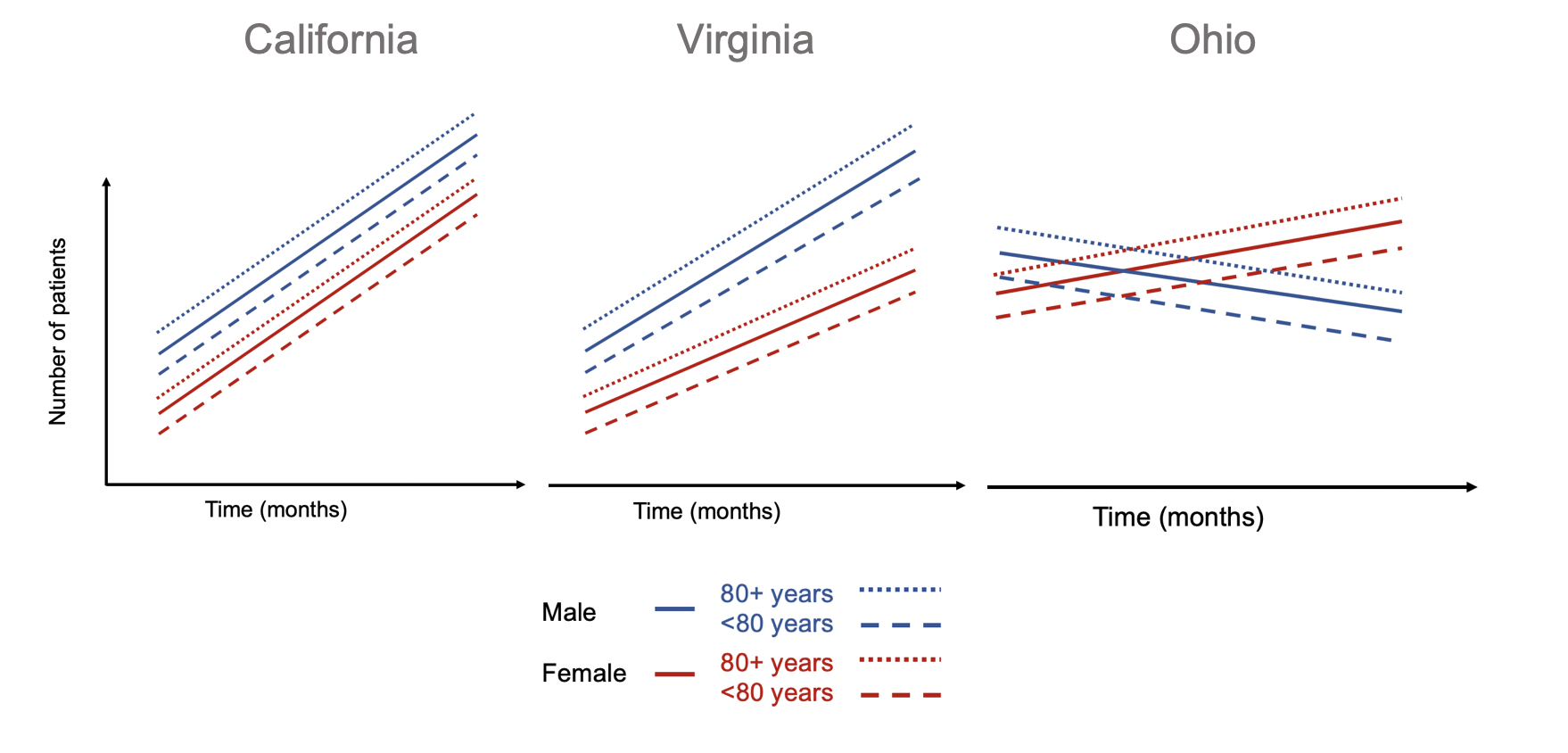
A simple way to introduce a fifth dimension is to use the concept of small multiples by Edward Tufte.[1] Tufte uses small multiples to include additional dimensions. Figure 4 illustrates how we can leverage small multiples to look at the differences in the relationships between number of patient and time for different genders and age groups across different states.
Figure 4. Small multiples of states with differing patterns of number of patients and time for different genders and age groups.
Using small multiples allow us to compare the differences in the association between number of patients and months across different states stratified by gender and age groups. The number of patients increased across time for all gender and age groups in California. Similar patterns are observed in Virginia, but the rate of increase in the number of patients across time is lower in the female group and age cohorts. In Ohio, different patterns are observed compared to California and Virginia. Males and their associated age groups have a decreasing number of patients across time. Conversely, females and their age cohorts have a positive correlation between the number of patients and time.
CONCLUSIONS
Adding dimensions can improve the figure you design by incorporating complex relationships across different data characteristics. In our example, we demonstrate how we can integrate dive dimensions of data to a two-dimensional figure that tell us information about the association between the outcomes (number of patients) with time (months) across states stratified by gender and age groups. Be creative with how you integrate multiple dimensions into a figure. Ask yourself if this is something that will help improve the story the figure is conveying. There are times when a simple figure will do. But when you have a lot of data and want to tell a story, consider adding dimensions to the figure to get a narrative that will excite and capture your audience’s attention.
REFERENCES
Tufte ER. The Visual Display of Quantitative Information. Second. Cheshire, CT: Graphics Press, LLC.; 2001.


