BACKGROUND
Box plot (box and whisker diagram) is a great way to display distribution of a continuous (e.g., interval) data variable. A typical box plot will contain the mean, median, interquartile values, and the minimum and maximum values. Figure 1 illustrates these elements on a box plot. Up until recently, Microsoft Excel did not have an option to graph box plots. However, in the 2016 version of Microsoft Excel, box plots were added as part of the statistical features.
Figure 1. Example of a box plot (box and whisker diagram (Figure 1).

MOTIVATING EXAMPLE
We will use data that was randomly generated to create box plots across four hypothetical quarters (Q1FY19, Q2FY19, Q3FY19, and Q4FY19). The data will contact the number of visits to the doctor from several outpatient specialty clinic. Here is what the data looks like from the first two sites. Data for the example can be found here.

Site 1 has 45 visits in Q1FY19 and Site 2 has 44 visits in Q1FY19. To create the box plots, we need to use the long format which uses multiple rows for each site.
EXERCISE
In this article, we will generate box plots that will visualize the average number of visits and its distribution across quarters.

After clicking on the Box and Whisker plot, you will need to select the data that will be used to generate the box plots across the quarters.


Click “OK” and the default box plot will look like Figure 2.
Figure 2. Default box plot generated by Excel 2016.
After a few changes to the color and labels, our box plot can be improved (Figure 3).
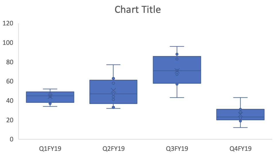
Figure 3. Updated box plots.

These box plots give us an idea of the changes in the number of visits across quarters including the distribution of the data. For each box plots, the mean indicated by the “X” is not too different from the median (indicated by the solid horizontal line). However, there is greater variation in the distribution of the number of visits in Q2FY19 and Q3FY19 compared to Q1FY19 and Q4FY19. We can see that there was an increase in the number of visits, on average, between Q1FY19 and Q3FY19, but this drop significantly in Q4FY19. This may be due to some kind of change (e.g., seasonal variation) and should be explored.
Conclusions
The box plot provides us with a nice data visualization of the mean number of visits across quarters including the variation and distribution of the data. Plotting these in Microsoft Excel 2016 will allow you to explore your data and motivate you to explore and generate some explanation or hypothesis for their behavior.
References
I used several online references to write this article.
The Dummies series provide a good illustration of the box plot elements, which can be located here.
I watched this YouTube video by stickpet on how to use Microsoft Excel 2016 to generate box plots.