Excel

Using Excel VBA macros to conduct one-way sensitivity analyses and tornado diagram

INTRODUCTION

In pharmacoeconomic analysis, we oftentimes incorporate data from external sources to inform the parameters of our economic models. It’s not uncommon for us to have some degree of uncertainty surrounding the values of our parameters. The size and influence of each uncertainty may influence our conclusions, which can significantly change based on a single parameter. For instance, if a new drug (Drug A) entering the market had an incremental cost-effectiveness ratio (ICER) that was greater than the stakeholder’s willingness-to-pay (WTP) threshold when compared to standard of care (Drug B), lowering Drug A’s price may move the ICER to below the WTP threshold (Figure 1). This could change the conclusion of the study from “Drug A is not cost effective compared to Drug B,” to “Drug A is cost effective compared to Drug B.” Of course, this depends on where the WTP threshold is located on the cost-effectiveness plane, but it highlights the importance of understanding the influence of a single parameter to a pharmacoeconomic model’s conclusion. This type of analysis to understand the influence of a single parameter on the model’s conclusion can be illustrated using a one-way sensitivity analysis.

Figure 1. Example of the incremental cost-effectiveness ratio (ICER) changing due to a change in the price of Drug A.

Multiple one-way sensitivity analyses can be performed and arranged in a way to visualize the parameters with the greatest influence on the study’s outcome using a tornado diagram. The tornado diagram arranges the impact of each one-way sensitivity analyses from largest (top) to smallest (bottom) on the chart (Figure 2).

Figure 2. Example tornado diagram.

You can perform multiple one-way sensitivity analysis and arrange them in a tornado diagram using Excel’s Visual Basic Application (VBA) macros. In this tutorial, you’ll be able to create a series of VBA macros to conduct one-way sensitivity analyses and visualize these as a tornado diagram.


MOTIVATING EXAMPLE

We will use a hypothetical decision tree model to perform a series of one-way sensitivity analyses. You can download the Excel file and high resolution images for this tutorial from the GitHub repository for Decision Tree Tutorials here. The example decision tree and its parameters are illustrated in Figure 3.

Figure 3. Decision tree and relevant parameters.

The base-case ICER comparing Drug A to Drug B is $5875 per one additional Cure achieved (Figure 4). The ICER is located in the Northeast quadrant.

Figure 4. Results from the decision tree and cost-effectiveness plane.

We will create a macro that will replace the Base-case value with the LL and UL values (lower limit and upper limit, respectively) for every parameter and re-calculate the ICER each time.

Here is what the final one-way sensitivity analysis table will look like after the macros are run (Figure 5). Notice how the Number column is not in ascending order. That’s because this is ordered by the Spread column, which is the absolute difference between the UL_ICER and LL_ICER. We sort by the Spread because it allows for the tornado diagram to place the parameter with the greatest influence on the base-case ICER at the top and the parameter with the least influence at the bottom.

Figure 5. Results from the one-way sensitivity analysis.

We will create three macros. The first macro will sort the Number column in ascending order. This helps with the one-way sensitivity analysis calculations. The second macro will perform the one-way sensitivity analyses by replacing the Value with the LL or UL values. The last macro will sort the Spread in descending order for the tornado diagram.

Note: In this tutorial, the tornado diagram is already generated and mapped to the data on the one-way sensitivity analysis table. I wrote a tutorial on how to create a tornado diagram, which can be accessed here.

To create and edit macros, you will need to make sure that the Developer tab is available on the ribbon panel (Figure 6).

Figure 6. Developer tab on Excel’s ribbon panel.

In Excel, go to the File > Options. In the Options window, select Customize Ribbon and check the box next to Developer in the Main Tabs column (Figure 7).

Figure 7. Enabling the Develop tab in the Options window.

Once the Develop tab is enabled, we can begin to examine the macros. To open the VBA editor, go to the Develop tab and click on Macros as seen in Figure 8. There are several macros that we can see under the Macro window. Select the oneway_order macro and click on Edit. This will open the VBA editor where we can examine the macro.

Figure 8. Open the VBA editor.

The VBA editor has several important features.

In the left panel are the various macros and their location. The right panel contains the VBA code for the macro. The macro controls allow you run (“Play”), pause, or stop the macro.

Figure 9. VBA editor interface.

Note: Normally, we save our Excel file using the *.xlsx extension. However, when you have an Excel macro, you need to save the file as an *.xlsm extension. This will allow you to save your macros and enable them later.

VBA Macro 1 – Sorting the one-way sensitivity analysis table

Let’s examine the first macro: oneway_order

The VBA code first selects the sheet, which is labeled as OWSA model. Within the sheet, it selects the area defined by AM7:AV15 which is the one-way sensitivity analysis table in the Excel spreadsheet. The next part of the code orders the one-way sensitivity analysis table in ascending order based on the values in the Number column which is defined as AM8:AM15.

Note: Since this is on the same worksheet, we can leave the label of the active sheet as OWSA model. But if you were using different worksheets, you need to make sure to change the active sheet’s name.

The second part of the code tells the VBA macro to sort according to columns and that the first row contains the headers or column labels.

Figure 10. VBA Macro 1 – sort by ascending order the one-way sensitivity analysis table.

VBA Macro 2 – Re-calculate the ICERs with the lower and upper limits for each parameter

The second macro performs the one-way sensitivity analysis, and it is labelled as oneway_macro. Let’s take a close look at the VBA code for this macro. Notice how there is a low and high component in this macro. This is due to the LL and UL on the parameters table in the decision tree model. The oneway_macro will replace the base-case values with the value from the LL and UL columns in the decision tree model. This will need to be repeated for each parameter. In this decision tree model, there are 8 parameters that we will perform the one-way sensitivity analyses on. For the VBA macro, we will call these 0 to 7.

Figure 11 provides a close inspection of the macro and its elements in relation to the decision tree model in Excel. Notice that this is a loop function. The loop will start at 0 and end at 7 iterations, which is a total of 8 iterations, the same number of parameters in the decision tree. In the VBA macro, this is initiated with For low = 0 to 7 and then repeats with Next low until it reaches 8 iterations.

By changing these parameters with the LL and UL values, the ICER will be re-calculated. Once recalculated, we can update the one-way sensitivity analysis table with the new ICER value. In the VBA macro the re-calculated ICER is in cell AI7, and its value is imputed into the one-way sensitivity analysis table starting at cell AT8.

One the VBA macro completes, all 8 parameters will have undergone the one-way sensitivity analyses, and the re-calculated ICERs would be imputed into the one-way sensitivity analysis table; the LL_ICER and UL_ICER columns will contain the re-calculated ICERs for the LL and UL values from the parameters table.

Figure 11. VBA macro to perform series of one-way sensitivity analyses.

VBA Macro 3 – Re-sort the one-way sensitivity analysis table using the “Spread” in descending order

Once the ICERs have been re-calculated using the LL and UL from the parameters table, we can estimate their influence by calculating the absolute difference between the UL_ICER and LL_ICER. We want the absolute difference because we’re interested in visualizing the difference with the low and high values from each parameter.

Here is what VBA Macro 3 looks like:

This is very similar to the VBA Macro 1, which orders the one-way sensitivity analysis table based on the Number column. The only difference is that instead of using the Number column, VBA Macro 3 will sort in descending order the one-way sensitivity analysis using the Spread column, which contains the absolute difference between UL_ICER and LL_ICER.

Let’s take a look at the VBA macro closely (Figure 12).

Figure 12. VBA Macro 3 – re-order the one-way sensitivity analysis table by “Spread.”

The macro first selects the one-way sensitivity analysis table (AM7:AV15). It then selects the Spread column to sort in descending order (AM8:AM15). Once sorted, the macro will end.

Note: You may notice that the Order:=xlAscending option may sound counter-intuitive since we are sorting by descending order. The reason why the option has this in xlAscending order is because the tornado diagram uses a reverse axis on the Format Axis option (see Figure 13).

Figure 13. Format axis option to have the categories in reverse order.

Assigning macros

Once the one-way sensitivity analysis table is completed, we can assign these macros to buttons on the worksheet.

We can create buttons using the Shapes function in Excel. Right-click on the shape and select Assign macro. Create three of these. Figure 14 illustrates the steps to assign macros to each button.

Figure 14. Assigning macros to buttons in Excel.

We will assign oneway_order macro to the first button (Figure 15).

Figure 15. VBA Marco 1 assigned to the “Step 1” button.

We do the same thing for VBA Macro 2 (Figure 16).

Figure 16. VBA Macro 2 assigned to the “Step 2” button.

Lastly, we assign the final VBA macro to the “Step 3” button (Figure 17).

Figure 17. VBA Macro 3 assigned to the “Step 3” button.

Final steps

One all the buttons have been assigned to a VBA macro, we can click on each one in order to repeat the steps of re-calculating the ICER and updating the one-way sensitivity analysis table.

We can also see the changes to the tornado diagram (Figure 18).

Figure 18. Final tornado diagram.

At this stage of the tutorial, it’s good practice to inspect your entire Excel file to ensure that no data was accidentally lost or erased during the creating of the macros. Sometimes, if we select the wrong cells, we can overwrite our data. It’s good practice to save different versions of the Excel file so that you can return to your previous work in case something goes wrong.


Conclusions

Excel provides a power tool to generate VBA macros to perform functions iteratively. We leveraged this tool to perform a series of one-way sensitivity analyses which we then used to create a tornado diagram. Since this tutorial used a single worksheet, the process is much easier to code and diagnose. However, as we expand and create more worksheets in our Excel file, we need to be careful to select the proper sheets when using these VBA macros.


Acknowledgements

I used templates of previous one-way sensitivity analyses to build these VBA macros in this tutorial. Admittedly, it has been years since I first began doing this in Excel, and I don’t recall the sources. However, I wanted to acknowledge them as they deserve all the credit for helping me understand and apply these tools to building pharmacoeconomic models. If I find out the sources of these macros, I will post them here. I do know that my courses at the University of Washington was a source for some of the VBA macros for constructing pharmacoeconomic models, and I wanted to acknowledge their work and materials.


References

You can download the Excel file(s) from the GitHub Repository on Decision Trees Tutorials (link).


Disclaimers

This is a work in progress, therefore, there may be updates in the future.

This is for educational purposes only.

Constructing a Markov model for cost-effectiveness analysis using Excel: A tutorial

I wrote a tutorial on how to construct a Markov model using Excel, which is available on my RPubs site (link). This was meant to complement a workshop that I am preparing for trainees interested in pharmacoeconomics.

The Markov model is a versatile mathematical model that allows researchers to simulate a chronic disease for many years. It is unique due to its features such as disease states which can contain the costs and benefits associated with them.

I posted files associated with this tutorial on my GitHub Markov Model Tutorial respository (link). These include some readings to provide sufficient background and the Excel file with the Markov model example. To properly download these files, make sure to go to the “Raw” file and right clich on the “Raw” option then “Save link as” onto your computer. There is a detailed explanation on the RPubs tutorial.

This is a work in progress, so expect some updates in the future.

Communicating data effectively with data visualizations: Part 34 (Progress bars in Excel)

INTRODUCTION

With the introduction of the COVID-19 vaccines, states have monitored their vaccination progress. Current progress of each state’s vaccination rates are available at USAFacts.org. California, which has been experiencing some of the highest COVID-19 related rates and deaths, has approximately 81.2% of its current allocation of COVID-19 vaccines. Here is a screen capture of California’s progress as of 22 February 2021:

This visualization contains several progress bars showcasing the COVID-19 vaccination progress in California. We will re-create this in Excel using the data presented in this visualization.


Step 1. Enter data into Excel.

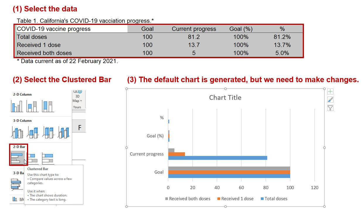
Using the visualization, we can enter the data into Excel. The data should be arranged in the following manner as reflected in Table 1:

Step 2. Select the data and insert a clustered bar chart.

Figure 3.jpg

The default chart is automatically generated by Excel. However, we want to have the labels for the axis to denote the legend. To do that we need to right-click on the chart area and click on “Select Data…” This will bring up a window where you will need to click on “Switch Row/Column” to change the horizontal axis labels.

Figure 4.jpg

Step 3. Modify chart to add data labels.

Right-click on the chart area and click on “Select the data…” This will bring up a window that will allow you to make changes to the data structure. We will unselect the “Goal” and “Current progress” data. This will only leave the Goal (%) and % bars. Next, right-click the top bar and click on “Add data labels.”

Figure 5.jpg

Step 4. Overlap the two bars.

Next, we want to overall the two bars so that we can show the progress of vaccinations in California. Right-click on one of the bars and click on “Format Data Series…” Change the series overlap to 100%. This will cause the two bars to overlap, which will look like a progress bar. Since we only left the data label for the top bar, we can see distinctly the vaccination progress in California.

Figure 6.jpg

Step 5. Modify the aesthetics.

The progress chart is modified using the Abadi font and changed the patterns and colors of the bars. I also added the title “COVID-19 vaccination progress, California.

Figure 7.jpg

Step 6. Add some text.

Then we can add some text to emulate the visualization from USAFacts.org. Change the order of the data so that it reflects the one on the USAFacts.org website.

Figure 8.jpg

Conclusions

Using the overlap feature of Excel will allow us to make progress charts. The example from California showcases how this visualization can effectively show the current vaccination progress. These types of visualizations will help decision makers monitor progress and make any changes when necessary. Files for this exercise can be downloaded here.


References

Data from USAFacts.org.

Communicating data effectively with data visualizations: Part 31 (Visualizing COVID-19 deaths using sparklines)

INTRODUCTION

As the COVID-19 pandemic continues to place a public health burden on our society, the death toll in the United States has reached a terrible milestone; over 240,000 deaths were reported as of November 17, 2020.[1] COVID-19 is now the third leading cause of death behind heart disease and cancer followed by accidents (unintentional injuries) and chronic respiratory diseases (reported by Scientific American).[2] Of note is the epidemiology spread of new deaths over time. New York has borne the brunt of the incidental deaths; early in the pandemic New York City had the highest 7-day moving average of COVID-related death in the country (1,193 deaths in April 21, 2020), but, recently, the 7-day moving average has dropped to 8 deaths in November 16, 2020. One way that we can visualize this is to use sparklines. Excel has a feature that allows users to plot sparklines onto the spreadsheet. We will use this feature to visualize the change in new COVID-related deaths over time by state.


MOTIVATING EXAMPLE

We will recreate the following figure using the Excel sparklines feature to visualize the changing number of new deaths due to COVID-19 from January to October 2020. Data can be downloaded from the CDC Tracker site or from the Dropbox folder. (Data was pulled on November 18, 2020.)

CONSTRUCTING THE SPARKLINES

Step 1. Open and examine the data

You can download and open the Excel file located here. The data should look like the following:

The data are in wide format and are ordered by Total Deaths in descending order.  The abbreviation NYC represents New York City instead of the state. The data also include districts (some cities) and US territories.


Step 2. Identify the location of the sparklines options

Excel’s sparkline feature is located in the ribbon area. You can locate this in the Insert tab under the sparklines area.

For this tutorial, we will use the “Column” option. This will generate bar charts within the cell that we identify.


Step 3. Insert the sparkline

In the cell next to the “Total Deaths” column, we will add the column label “New Deaths Over Time.” Select the empty cell for the first state and insert the sparkline. A window will open prompting for information. Data Range should include the data for the state from Jan to Oct. Once you’ve selected your data, click on “OK.”

Step 4. Change row height to fit the sparkline

The sparkline is inserted into a narrow cell with a low row height. We can change this by right-clicking on the row label, selecting “Row Height…” changing the “Row Height” to 45, and then confirming that this is the height you want. Feel free to change the height to fit your needs.

Step 5. Select other states

At this point, the sparklines are nearly complete. You can expand this to the other states by selecting the corner of the cell and dragging the sparkline to the other cells.

Step 6. Hide cells

We can hide the cells with the number of deaths from Jan to Oct. However, when you do this, the sparklines will disappear. Excel uses the unhidden cells to create the sparklines. When you hide the data, the sparklines will not generate the visual. To fix this, open the sparklines ribbon and select the “Edit Data” box. This opens several options. Select the “Hidden & Empty Cell…” and click on the “Show data in hidden rows and columns.” This will allow you to hide cells that the sparklines are using to generate the visuals.

Step 7. Final touches

You can change the color of the sparklines and add some table lines to separate the states. In this tutorial, the Arial Nova Light font was used. Here is the final sparklines for the first five states with the most total number of COVID-related deaths in the United States.

CONCLUSIONS

Using sparklines can enhance a data visualization by adding a time series of historical events (e.g., COVID-19 deaths). This is useful when you want to incorporate this alongside some data in a table, spreadsheet, or dashboard. In our tutorial, we used the historical of deaths for each states in the United States to give the audience some perspective of what has occurred despite the high number of deaths. For instance, New York City had the highest number of total deaths, but historically, these deaths occurred in the months of April to July and dropped significantly in recent months. Other states started out with low number of deaths but have many their total deaths in recent months. This provides us with another dimension to the visualization of how different the epidemiologic spread of deaths occurred across the United States.

REFERENCES

  1. CDC. COVID-19 Cases, Deaths, and Trends in the US | CDC COVID Data Tracker. Centers for Disease Control and Prevention. Published March 28, 2020. Accessed November 18, 2020. https://covid.cdc.gov/covid-data-tracker

  2. Stix YZ Gary. COVID-19 Is Now the Third Leading Cause of Death in the U.S. Scientific American. Accessed November 18, 2020. https://www.scientificamerican.com/article/covid-19-is-now-the-third-leading-cause-of-death-in-the-u-s1/

Communicating data effectively with data visualizations: Part 29 (Forest plots)

INTRODUCTION

A recent paper by Wang and colleagues reported that patients with recent diagnosis of substance use disorder (SUD) had a greater risk for COVID-19.[1] The adjusted odds ratio was 8.699 with a 95% confidence interval (CI) of 8.411 to 8.997). Patients with opioid use disorder (OUD) were at the greatest risk.

The authors used a forest plot to summarize their findings (Figure 1). A forest plot is a diagram that displays the measurement of interest (e.g., odds ratio) with horizontal error bars to represent the 95% CI for several variables, which are aligned on the Y-axis. Forest plots are common in pair-wise meta-analysis where multiple studies are used to describe the effect size of the treatment versus the comparator group. Studies are arranged along the vertical axis and the odds ratio with 95% CI are displayed next to the studies. This allows the readers to see the effect size (e.g., odds ratio) and the uncertainty surrounding each study (or variable) in the meta-analysis.

Wang and colleague used this method to illustrate the odds of developing COVID-19 for different types of substance use disorders diagnosis along with their uncertainties. It’s an effective way to illustrate how much of a risk each SUD diagnosis category is associated with developing COVID-19.

Figure 1. Forest from the study that we will recreate.[1]*

(*This figure is used for educational purposes only.)

DATA

We will use the study by Wang and colleagues[1] to recreate their forest plot using Excel. Although it is much easier to code this in Stata or R, for the purpose of this tutorial, we will use Excel.

Step 1. Get the data

Since there are a few data points, we can enter these directly into an Excel spreadsheet. There are some nuances that we will need to consider when plotting these data points. A template is available to assist you with entering the data correctly. I have provided an illustration below for how you should set up your data in Excel. (You can download this template here.)

Once the data have been entered into Excel, we can begin to generate the figure.


Step 2. Insert a scatter plot chart

In the tab, select Insert and then select the scatter plot drop down. You will see a series of different scatter plots to choose from. Select the one that says “Scatter.”

Step 3. Select the data for the Scatter plot

Right-click in the empty chart area to select the data. Select the Add button to select the data of interest.

In the Series name field, enter “data.” Then for the Series X-values, select the values in the Odds ratio column. For the Series Y-values, select the value in the Y position column as indicated in the figure.

Your scatter should appear on the Chart area.

Step 4. Add labels on the Y-axis

We want to have the labels on the Y-axis indicating what SUD diagnosis was associated with an increased odd for developing COVID-19. Similar to the previous data entry, we will begin by Right-clicking on the Chart Area and selecting Add data. For the X values, select the values in the Y Label position column. For the Y values, select the values in the Y position column as indicated below. Once you select the data, the Chart Area will update with the orange scatter points on the Y-axis.

Right-click the orange scatter points on the Y-axis. Then select the “Add Data Labels” to include data labels to the orange scatter points.

Right click on the data labels and click on the Format Data Series. Make sure to check the box next to Series Name and uncheck the box next to Y value. Check the box next to the Values From Cell, click on the Select Range box to open another window where you can select the data labels. Select all the SUD diagnosis for this data range in the Select Data Label Range field.

Data labels for the SUD diagnoses will appear on the right side of the scatter on the Y-axis. Next, we will reposition the SUD diagnoses labels to the left of the Y-axis. Right-click on the orange scatter and then select “None” in the Marker options to remove the scatter on the Y-axis. Then Right-click on the Y-axis value and then enter the “Delete” key on your keyboard. This will remove the labels on the Y-axis (e.g., 1, 2, 3, 4, 5, 6, and 7). All that should remain are the SUD diagnoses labels. To reposition these, right-click on the SUD diagnoses labels and then check the “Left” option in the Label Position field.

This will reposition the SUD diagnoses labels to the left of the Y-axis.

Step 5. Add the error bars for the 95% CI

Next, we will include the horizontal error bars to represent the 95% CI. Click anywhere in the Chart Area and the Chart Design tab will become available in the Ribbon. Select “Add Chart Element” dropdown arrow to open up the available options and select “Error Bars.” Select the “Standard Errors” to display both the horizontal and vertical error bars around the scatter points on the chart.

We want to keep the horizontal error bars, so we need to delete the vertical error bars. Select the vertical error bars and then hit the “Delete” key on your keyboard. This will remove the vertical error bars and leave you with only the horizontal error bars. Next, you want to adjust the horizontal error bars. Currently, this is not displaying the correct 95% CI. Right-click on the horizontal error bar and select the “Format Error Bars…” option.

Select the “Specify Value” box next to the Custom option for the error bars. We will determine what Excel plots for the 95% CIs. For the “Positive Error Value” select the values under the “UL – OR” column. Similarly, for the “Negative Error Value” select the values under the “LL – OR” column.

The appropriate error bars now reflect the 95% CIs from the figure generated by Wang and colleagues.

Step 6. Adding the null line at Odds Ratio = 1

To add the vertical line that cross where the odds ratio (OR) is equal to 1, we need to use the column “Null position.” Right-click anywhere on the Chart Area and click on “Select Data. This opens up the data menu. Click on “Add Data.” Then follow the instructions to select values in the Null Position column for the Series X values box and the values in the Y position column for the values in the Series Y values box. We’ll name the “null” data series since this is where the odds ratio is equal to 1.

Right click on the scatter and select “Change Series Chart Type” to open the window where you can select different chart styles. For the Null data series (e.g., odds ratio is equal to 1), change the Chart Type from “Scatter” to “Scatter with Straight Lines.” This will generate a straight vertical line along the values where the odds ratio is equal to 1.

Right-click on the scatter point along the straight line and Format Data Series…; then remove the marker by selection None under the Marker Options.

Step 7. Modify the chart presentation

At this stage, most of the necessary steps to include the forest plot is complete. Final steps involve changing the colors, adjusting the length of the Y-axis, and removing the gridlines. I also included the odds ratio (OR) and 95% CI by the forest plot on the right side by enter each value into the corresponding cells in Excel. I also added a blue line at the top of the forest plot and some text boxes for the labels corresponding to the SUD diagnoses and the odds ratios with their 95% confidence intervals.

CONCLUSIONS

The final Excel forest plot is similar to the one generated by Wang and colleagues.1 I opted to leave out the P-values since they were all significant and did not include any additional information to the chart. Some additional modifications included the use of a red dotted line for where the odds ratio (OR) is equal to 1 and the use of a blue top border to separate the labels for the chart columns.

Forest plots are great when you want to show the impact each variable has on a particular outcome. In our example, each of the different SUD diagnosis has an impact on the odds of developing COVID-19. From the forest plot, it is easy to identify OUD as having the greatest odds of developing COVID-19.

One additional thing that we can do is order this from the highest odds ratio to the lowest odds ratio, which will give us a better way to compare relative strengths across the different SUD diagnosis categories (see below).

You can download the Excel file for this exercise here.

REFERENCES

  1. Wang QQ, Kaelber DC, Xu R, Volkow ND. COVID-19 risk and outcomes in patients with substance use disorders: analyses from electronic health records in the United States. Mol Psychiatry. Published online September 14, 2020:1-10. doi:10.1038/s41380-020-00880-7.

Communicating data effectively with data visualizations: Part 28 (Scatter plot)

INTRODUCTION

Between 1918 to 1919, the influenza pandemic (also known as the “Spanish Flu”) raged across the world and caused over 40 million deaths. Cities in the United States enacted nonpharmaceutical interventions (e.g., social distancing, shelter-in-place mandates) to reduce the transmission of the influenza pandemic, overall and peak attack rates, and the number of deaths. Some of the cities were successful in mitigating the calamity associated with the pandemic, but others were not. The experiences that these cities learned in the past yield important insight for policy makers today to tackle the current COVID-19 pandemic.

Markel and colleagues (2007) reported on the impact of nonpharmaceutical interventions enacted by cities in the United States and their effect that they had on mitigating the influenza pandemic of 1918 to 1919.[1] Briefly, their report highlights that cities that implemented these public health interventions early had greater delays in the time to reaching peak mortality, lower peak mortality rates, and lower total mortality.

We will recreate one of the figures (Figure 1c) in this manuscript using Excel and the data provided.

Figure from the study that we will recreate.[1]*

(*This figure is used for educational purposes only.)

DATA

Data for this tutorial come directly from the study’s Table 1. We will use the Public Health Response (days) in the X-axis and the Excess Pneumonia and Influenza Mortality rate (deaths per 100,000 population). You can download the data from the following link.

Step 1. Get the data

Download the data from this link. Data has been cleaned specifically for this tutorial.

Step 2. Insert a scatter plot chart

After downloading the data, open the Excel file. Look for the column that contains the Public health response time, days; this will be the data for the X-axis. Now, look for the column that contains the Excess pneumonia and influenza mortality, deaths / 100,000 population; this is the data for the Y-axis.

In Excel, insert the Scatter plot by selecting the Scatter option in the Charts tab.

Step 3. Select the data for the Scatter plot

An empty figure will appear. Right-click in any area in the empty figure and you should be able to click on “Select Data”. From there, click on “Add” to add data and select the appropriate data for the X-axis values and the Y-axis values.

Clicking “OK” will generate a scatter plot of the excess deaths across the time the public health responded to the pandemic.

Step 5. Adjust the axes

First, we want to move the Y-axis so that it is flushed with the left side of the chart instead of intersecting at zero on the X-axis.

This will change the Y-axis position from its intersection on the X-axis = 0 to X-axis = -15.

Step 5. Change the color of the scatter

To finalize the scatter plot, change the color and size of the scatter.


FINAL SCATTER PLOT

Once all the adjustments have been made, we can add some data labels for some of the select cities, which were also highlighted with a different color.

CONCLUSION

After recreating the figure from the paper by Markel and colleagues,[1] it is clear that as public health response is delayed, there is a general trend for excess deaths due to the influenza pandemic to increase. Although other types of interventions occurred during this pandemic, the findings from Markel and colleague provides some empirical evidence that early public health measures have significant contributions in terms of mitigating the excess deaths due to the influenza pandemic. Policy makers can use the lessons from the past to inform them about the effectiveness of public health nonpharmaceutical interventions in delaying or reducing the mortality of the current COVID-19 pandemic.

REFERENCE

  1. Markel H, Lipman HB, Navarro JA, et al. Nonpharmaceutical Interventions Implemented by US Cities During the 1918-1919 Influenza Pandemic. JAMA. 2007;298(6):644-654. doi:10.1001/jama.298.6.644

Communicating data effectively with data visualizations: Part 24 (Mortality Curves)

INTRODUCTION

The continual threat of infection by severe acute respiratory syndrome coronavirus 2 (SARS-CoV-2) has ground the world to a metaphysical stop. Economies appear to be under threat of a long recession, political debates have delayed needed relief to citizens, lack of N95 masks for healthcare workers place them at greater risk for doing their jobs, and mortality has increased world-wide. We are undoubtedly experiencing an seminal period in the 21st Century and data analysts have rushed to develop stunning visuals and dashboards such as the ones developed by Johns Hopkins University, “Our World in Data”,1 and the Centers for Disease Control and Prevention to feature the impact the SARS-CoV-2 is having on our world.


MOTIVATING EXAMPLE

In this article, we will replicate the total deaths due to SARS-CoV-2 using data from the European Centre for Disease Control and Prevention (ECDC)2 or from the Our World in Data’s GitHub site.3 Due to the changing nature of SARS-CoV-2 data, this exercise will have used data that would ultimately be updated in the future. Please visit the ECDC site to download the most recent SARS-CoV-2 data.

The figure we will replicate is one posted on the “Our World in Data” website and looks like the following:

Source: Our World in Data. Total confirmed COVID-19 deaths: How rapidly are they increasing? URL: https://ourworldindata.org/grapher/covid-confirmed-deaths-since-5th-death [last accessed: 17 April 2020].

We will download data from the ECDC and then use Excel to recreate this plot for several countries (we won’t create plots for all the countries, but you can feel free to do so by taking advantage of the available data).

Step 1. Download data from the ECDC.

You can download the raw data from the ECDC’s site here. Alternatively, you can also download the cleaned data for this article here (I cleaned the data and prepared them for use in Excel).

The data has the following format:

Figure 2.png

Each column represents a country and the rows represents the total number of deaths for each day after the 5th confirmed death.


Step 2. Select all of the data and insert a line chart.

Once all the data have been downloaded, select all of them. Insert a line chart and Excel will automatically generate a figure for you. This figure will need to be edited further, but Excel does a good job of plotting the total number of deaths along the X-axis (time).

Right-click in the chart region and click on the Select Data option. You want to de-select the “Days since the 5th total confirmed death” because this is not the value of interest. Rather, this represents the values for the X-axis (time).

Once you de-select the “Days since the 5th total confirmed death,” your line chart should look like the following figure.

Step 3. Changing the scale on the Y-axis.

In the figure from the Our World in Data, the values for total deaths are plotted using a log-scale. When Excel generates the line chart, it automatically uses the continuous scale on the Y-axis. To change this, you need to right-click on the Y-axis and then select Format Axis...

Once you make the changes to the Y-axis scale, the line chart should now look similar to the one from Our World in Data.

Step 4. Adding the axes labels and formatting the lines.

Once the line chart’s Y-axis has been transformed into a log-scale, you can make changes to the axes labels and the line formatting. Select the Design tab to made changes to the Y-axis label. Select the Add Chart Element to open the drop-down menu, then select the Axis Title followed by the Primary Vertical option. This will allow you to make changes to the Y-axis label.

Change the Y-axis label to read, “Log number of COVID-19 deaths.” Do the same thing for the X-axis label, but change it to read “Days since 5th death occurred.” Your figure should look like the following.

You can make the lines thinner by right-clicking on one of them (e.g., China), opening up the options. Select Format Data Series… and then adjusting the Width to be 1.5 points. This will make the line easier to see without having to take up space with the thicker lines.

Repeat this process for all the lines in the chart. Once you have completed that, the line chart should look like the following.

Step 5. Now all that’s left is changing some of the aesthetics.

The final line chart replicates the figure from Our World in Data and provides the references line for a doubling in the number of deaths for each country. The reference line (“Doubling every 5 days”) was creating using a base of 10 on a log-scale to replicate a doubling of that value every 5 days. The reference line was also placed on a secondary axis to create a continuous line (since creating a line on the same scale as the other countries would have yielded gaps because we’re doubling deaths every 5 days). In the Design tab, you can add the secondary horizontal axis to match that of the primary horizontal axis (time). The secondary vertical and horizontal axes had their font color changed to white to hide them from view and to clean the final figure.

Gridlines were added along with the label for the reference line, which indicates to point where the total confirmed SARS-CoV-2 deaths are doubling every five days.

Here is the final chart after some formatting changes were made.

Conclusions

Although we plotted total deaths from SARS-CoV-19 from existing data, these were limited to five countries. More countries can be added using the available data, and it is encouraged that you try to plot all the other countries as an exercise. The reference line provides us with the doubling of deaths on a log-scale and carefully provides the readers with a threshold where certain doubling of deaths would be reported. China seems to have controlled their total number of deaths, but there is a spike at the end of day 87 that shows an increase in deaths. This may be due to reporting error or a change in the definitions of death. The US, including the other European countries, are trailing the rest of the world in containing the SARA-CoV-2 pandemic. Hopefully, this type of data visualization will help inform decision makers to develop policies that would mitigate the impact of SARS-CoV-19 on mortality any parts of the world.

You can download the data and complete exercise here.

References

  1. Roser M, Ritchie H, Ortiz-Ospina E, Hasell J. Coronavirus Disease (COVID-19) – Statistics and Research. Our World Data. March 2020. https://ourworldindata.org/coronavirus. Accessed April 17, 2020.

  2. European Centre for Disease Control and Prevention. Download today’s data on the geographic distribution of COVID-19 cases worldwide. European Centre for Disease Prevention and Control. https://www.ecdc.europa.eu/en/publications-data/download-todays-data-geographic-distribution-covid-19-cases-worldwide. Published April 18, 2020. Accessed April 18, 2020.

  3. Our World in Data. GitHub: Owid/Covid-19-Data. Our World in Data; 2020. https://github.com/owid/covid-19-data. Accessed April 18, 2020.

Communicating data effectively with data visualizations: Part 22 (How to create a double axes figure in Excel)

INTRODUCTION

Displaying two types of information on a single figure is commonly done using double axes. Normally, you would use a single y-axis to reflect the outcome or metric of interest and a single x-axis for a standard set of categories (e.g., time). However, if the scales are different, leveraging a secondary axis can enhance and improve the visualization. In this article, we will demonstrate how to create a secondary axis using Excel.


MOTIVATING EXAMPLE

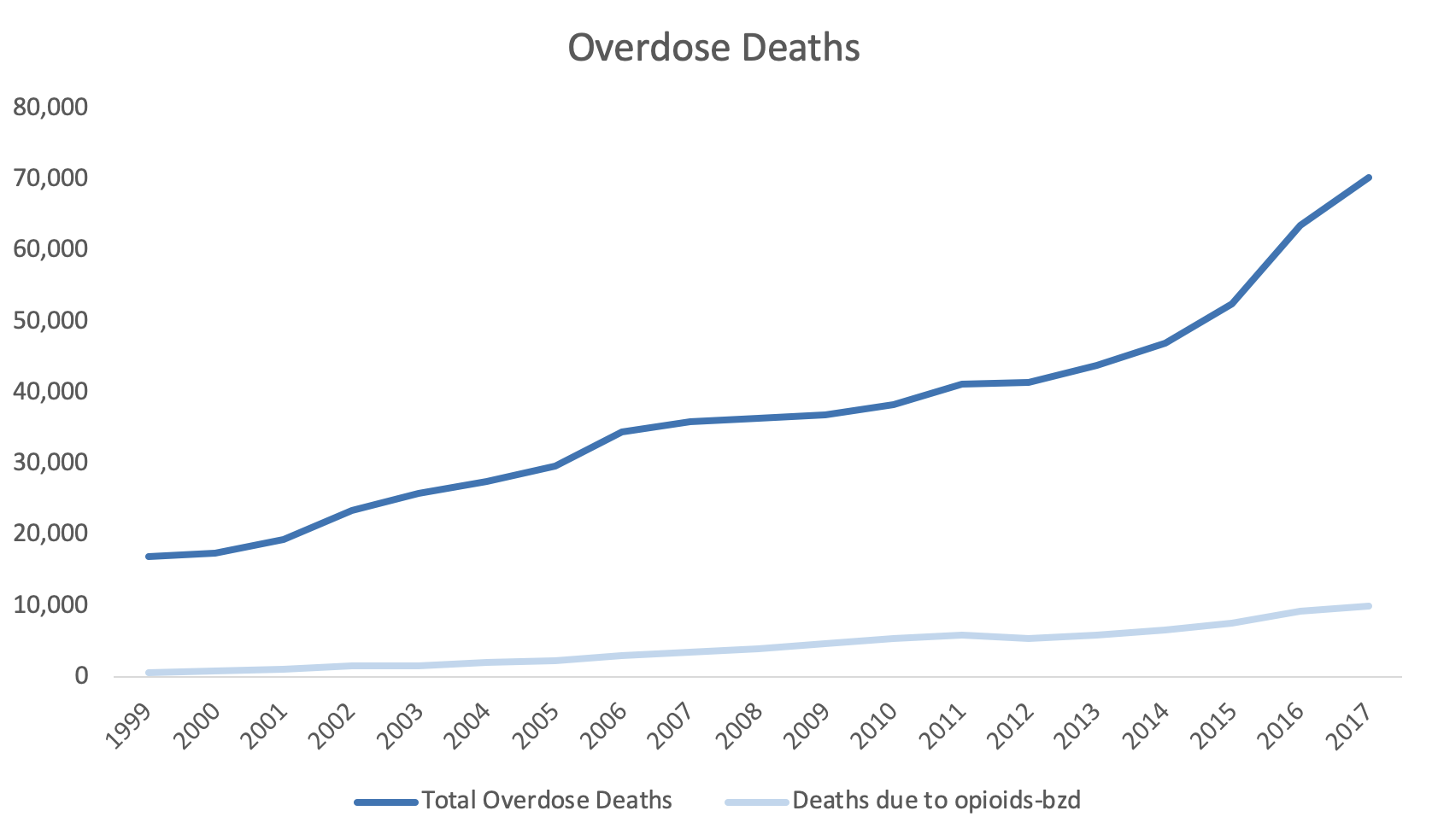
For example, the total overdose deaths are plotted on the y-axis and the year is plotted on the x-axis (Figure 1).

Figure 1. Total overdose deaths in the United States, 1999 to 2017.Source: https://www.drugabuse.gov/related-topics/trends-statistics/overdose-death-rates

Figure 1. Total overdose deaths in the United States, 1999 to 2017.

Source: https://www.drugabuse.gov/related-topics/trends-statistics/overdose-death-rates

Total overdose deaths in the United States (US) is large and growing. In 1999 it started at 16,849 deaths, but by 2019, that number rose to over seventy thousand. This is a large number and the scale that is used can impact how the viewer will synthesize this visualization.

However, if you wanted to add another line or data dimension such as the number of deaths due to opioids with a benzodiazepine prescription, that number may not be on the same scale as the total overdose deaths that’s currently represented by the y-axis. Figure 2 illustrates the Total Overdose Deaths and Overdose Deaths due to an Opioid-Benzodiazepine combination. Notice how the Opioid Deaths due to an Opioid-Benzodiazepine combination is plotted on the same scale as the Total Overdose Deaths. Using the same scale makes it difficult to discern the change in deaths associated with an Opioid-Benzodiazepine combination.

Figure 2. Overdose Deaths due to Opioids, 1999 to 2017.

Figure 2. Overdose Deaths due to Opioids, 1999 to 2017.

To improve this, we may consider using a secondary y-axis to correctly scale for the number of deaths due to opioids-benzodiazepine co-prescribing.


Step 1. Open the Excel document with the data, which is located here.

Step 2. Review the data. In this example, we have the total overdose deaths and the deaths associated with opioids-benzodiazepine co-prescribing from 1999 to 2017.


Step 3. Select the three columns and use the Excel Insert tab to select the line figure.

Figure 4.png

Step 4. Review the line graph.

The default line plot that is generated includes all the variables in a single y-axis. This is not what we want.

Figure 5.png

We need to correct this and select the correct axes for these variables.


Step 5. The Year variable needs to be on the x-axis.

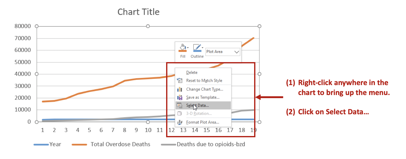
Right-click anywhere on the chart space. A menu of options will appear. You want to click on the Select Data… option to make changes to the data and how they are displayed on the chart.

Figure 6.png

Then Remove the Year variable from the Legend Entries (Series) panel. This will remove Year from being plotted on the y-axis. Next, you want to edit the Total Overdose Deaths in the Horizontal (Category) Axis Labels panel.

Figure 7.png

After clicking on Edit, you will be given a small window to select the range of data to display on the x-axis. Use the button in the Axis label range to select the Years 1999 to 2017. This will populate the x-axis with the years corresponding to the Total Overdose Deaths.

Figure 8.png

Step 6. Selecting the secondary y-axis.

Once the Year has been correctly specified, we can create a secondary y-axis to represent the Deaths due to opioids-bzd since these numbers are much smaller than the Total Overdose Deaths.

Right click on the line that represents Deaths due to opioids-bzd. Select the Format Data Series… option. This will give you a menu with the choice to use the Primary or Secondary axis. Select the Secondary axis.

Figure 9.png

This will generate a chart that will include two y-axes: (1) Total Overdose Deaths and (2) Deaths due to opioids-bzd.

Figure 10.png

You can format the figure to improve its appearance with Excel’s other functions. In this example, the line colors were changed to provide a better contrast, the y-axes were properly labelled, and the font colors matched those of the lines.

Figure 12.png

CONCLUSIONS

Using double axes can improve the narrative of your data visualization. Take advantage of this option when presenting data with the same x-axis, but different measures. In this example, the metric of interest was death, but the scales were different. Total Overdose Deaths were significantly larger than Deaths due to opioid-benzodiazepine co-prescribing. Therefore, to better visualize the increasing number of deaths due to opioid-benzodiazepine co-prescribing, a secondary y-axis was added.


SUPPLEMENTS

Data and Excel file used for this exercise are available here.

Communicating data effectively with data visualizations—Part 19 (Doughnut charts)

INTRODUCTION

When comparing proportions or prevalence, the pie chart has been used as a favorite among Excel users due to its ease and familiarity. However, Tufte and other data visualization pioneers lament its use and recommend other graphical representations as alternatives.1 Doughnut charts are similar to pie charts except that the center is removed. Unlike pie charts which do not provide a good comparison of the proportional slices to one another, the doughnut chart focuses on the use of the length of the arcs for comparisons, which limit the potential for errors. By comparing the arc’s length of a doughnut chart to each other, you avoid the problem of comparing proportions between the slices in a pie chart.


MOTIVATING EXAMPLE

We will use data from the Centers for Disease Prevention and Control (CDC) to illustrate the number of tobacco products used among Middle and High-School students in the United States. You can download the Excel document here.

Source: Flavored Tobacco Product Use Among Middle and High School Students—United States, 2014–2018. url: link [Accessed on 17 October 2019]

Source: Flavored Tobacco Product Use Among Middle and High School Students—United States, 2014–2018. url: link [Accessed on 17 October 2019]

In 2018, there were 73.98 students per 100 population who reported using e-cigarettes. This was followed by a vastly lower prevalence of 28.66 students per 100 population who reported using Menthol cigarettes and 26.63 students per 100 population who reported using cigars. The CDC undertook this investigation to assess the types of tobacco products used by students. Based on this data, e-cigarettes appears to be a popular tobacco product. 

We will generate a doughnut chart to illustrate the prevalence of different tobacco product use in students.

CREATING A DOUGHNUT CHART

We want to create a side-by-side comparison between the different types of tobacco use in students using the prevalence, number of students per 100 population. This will allow us to make easy comparisons using the circumference of the doughnut charts.


Step 1. Set up the data

Since the prevalence is the number of students per 100 population, we can define our denominator as 100. Therefore, if 73.98 students reported using e-cigarettes, then 26.02 students did not (100 – 73.98). The table below provides the calculations to estimate the remainder column.

Figure 2.png

Once the remainder column has been calculated, we can Insert the doughnut chart onto our Excel worksheet.

Step 2. Insert donut chart

Select the prevalence and remainder data for the e-cigarette row.

Figure 3.png

Then Insert the doughnut chart using the Excel ribbon.

Once you select the doughnut chart, Excel will generate a default chart for you.

 
Figure 5.png
 

Step 3. Change the size of the doughnut chart

The default size is not balanced. We want to make the height and width the same size. To do that, we start by clicking on the Format tab and then going to the dimensions box to change the defaults to 4 inches by 4 inches.

Step 4. Change the size of the doughnut ring

The current doughnut ring is too thin. We can change this by right-clicking on the doughnut and selecting the Format Data Series. It will open a window with options to modify Doughnut Hole Size. Change this from the default to 65%. 

Step 5. Add data labels

To add data labels, right-click on the doughnut and select Add Data Labels. The data labels will populate both segments of the doughnut.

Step 6. Change font size and color palette

We can improve the aesthetics of the doughnut chart by increasing the font size and changing the color palette. In this example, I changed the font to Arial size 14 and I used the Blue Monochromatic Palette #1.

 
Figure 9.png
 

Repeat this for the other types of tobacco use and you can generate a series of doughnut charts that are easily comparable to each other.

CONCLUSIONS

Doughnut charts are better alternatives to pie charts because they use the arc of the circle to represent the proportion of the population. You can navigate through the differences quickly with the doughnut charts and see how different the prevalence of e-cigarettes are compared to other forms of tobacco use. This indicates that there is a huge popularity among students to use e-cigarettes as a favorite tobacco product. The implications of students using e-cigarettes let along any type of tobacco products are under investigation, but the data reported here highlight the popularity of e-cigarettes among students in the United States.  


REFERENCE

  1. Tufte ER. The Visual Display of Quantitative Information. Second. Cheshire, CT: Graphics Press, LLC.; 2001.

Communicating data effectively with data visualizations—Part 18 (Histograms)

BACKGROUND

Inspecting your data is an important part of data analysis preparation. Data, like all things, should behave according to some reasonable expectation. For example, if we randomly sampled a group of people in the U.S., we would reasonably expect to get 50% males and 50% females. Similarly, if we examined the age distribution of this sample, we would expect to have a normal distribution.

At the macro level, we may only be interested if the mean and standard deviations are representative of the population distribution. Since we sample from the population (randomly), we would expect to get similar means (and medians). This can be accomplished using simple Excel functions (or commands in statistical packages) to generate a descriptive summary. Table 1 describes the summary statistics for the total fat consumed by a sample of 8,327 responders to the National Health and Nutrition Examination Survey (NHANES) survey.

TABLE 1.png

We can see that the mean and the median are different, which is an indicator that the distribution is not normal. However, we may be interested in learning more about the distribution or behavior of this variable. Are there any outliers? How skewed is the distribution?

HISTOGRAMS

To visualize this, we will need to generate a histogram. A histogram is a visual representation (bars) of the distribution of data (usually continuous). It uses spacings called “bins” to count the number of times a value falls into that bin. A histogram looks like a bar chart, but the key difference is that in the histogram the adjacent bars are touching each other rather than having a space between them. Another difference is that histograms plot the frequency (or density) of a value or a range of values for a continuous data type; whereas, bar charts plot the count of a discrete data type (Figure 1).

Figure 1. Comparisons between histogram and bar chart.

Keep in mind that the number of bins for histograms should be just enough to make out the distribution and not too small to be too much information. This is Grice’s maxim of quantity where data are presented in an informative manner without overwhelming the audience with too much information.[1] Creating smaller bins to increase the resolution of the histogram is unnecessary when all you want is a general visualization of the data’s distribution.


MOTIVATING EXAMPLE

We will use data from the NHANES survey (2015-2016) to generate a histogram in Excel. The data can be downloaded from my Dropbox folder here. I cleaned the file so that all missing data were dropped. In total, there are three variables:

·      seqn = subject identifier

·      drqsdiet = special diet (Yes/No/Don’t know)

·      dr1ttfat = amount of total fat (gm) consumed

We will create a histogram to visualize the distribution of total fat consumed by the subjects. To start, let’s select the data and insert a histogram chart from the Insert Tab.

A histogram will be inserted near where your data are located on the worksheet. Excel automatically selects the bin sizes for you. But you can customize this to your needs.

Figure 3 -histogram.png

Right click anywhere x-axis and select Format Axis. You should see a column on the right side appear with options to modify the bin sizes.

You can modify the bin width, number of bins, the overflow bin, and underflow bin.

The bin width can be larger or smaller depending on how much resolution you want. You should balance this out with the appropriate number of bins you want to show. According Grice’s maxim of quantity, you don’t want to overwhelm your audience. In Excel, you can only modify either the bin width or the number of bins; never both.

The overflow bin indicates what the last bin should be. If anything is over the overflow bin value (X), then Excel will collapse those frequencies into that last bin. For example, if I wanted the overflow bin to be 137 grams or greater, I enter “137” into the overflow bin field. You can do the same thing on the other end of the x-axis with the underflow bin value.

Once you’ve figure out how to change the number of bins, let’s change the number of bins from 66 to 100, 75, 50, and 25 to observe how the histogram changes.

Notice that the histogram with a bin size of 100 is really fine whereas the bin size of 25 is blocky. We can tell from all of these figures that there is a right skew to the distribution due to a few outliers. There are 3 subjects who consume more than 400 grams of total fat compared to 19 subjects who consume between 300 and 399 grams of total fat. The higher resolution doesn’t really help us determine that the total fat consumption is right skewed compared to the figures with bin sizes of 75 and 50. If I were presenting to an audience or publishing an appendix, I would select either the figure with a bin size of 75 or 50. These two histograms illustrate the peak at the mean and the right-skewed distribution without violating Grice’s maxim of quantity. However, different situations will require you to make different choices, so I encourage you to explore the design features on Excels’ histogram.

STEM-AND-LEAF HISTOGRAM

The stem-and-leaf display is an alternative histogram that uses the prefix of number to assign positions into the bins. The following figure is a randomly selected number of subjects from our NHANES data. The first subject consumed 14 grams of total fat which is indicated by the 1* | 4. The 1* represents the first digit of “14” and the “|” separates the next digit. Similarly, there is one subject who consumed 22 grams of total fat indicated by the 2* | 2 and another subject consumed 24 grams of total fat (2* | 4).

 
Figure 7 - stem-and-leaf.png
 

CONCLUSIONS

Histograms are a great visualization tool to quickly check whether your continuous data are normally distributed. You can identify whether the mean is close to the median or whether there are left or right skewness to your data. Moreover, you can change the bin sizes of a histogram to become more refined or less so. But according to Grice’s maxim of quantity, it is best to present enough data that will get the information across to your audience without overwhelming them with unnecessary details.


REFERENCES

Grice, H. P. Logic and Conversation.  In Cole P. and Morgan J. (Eds), Syntax and Semantics: Vol 3, Speech Acts. Academic Press, New York, pp.43-58, 1975.