Stata

Survival Analysis - Immortal Time Bias with Stata

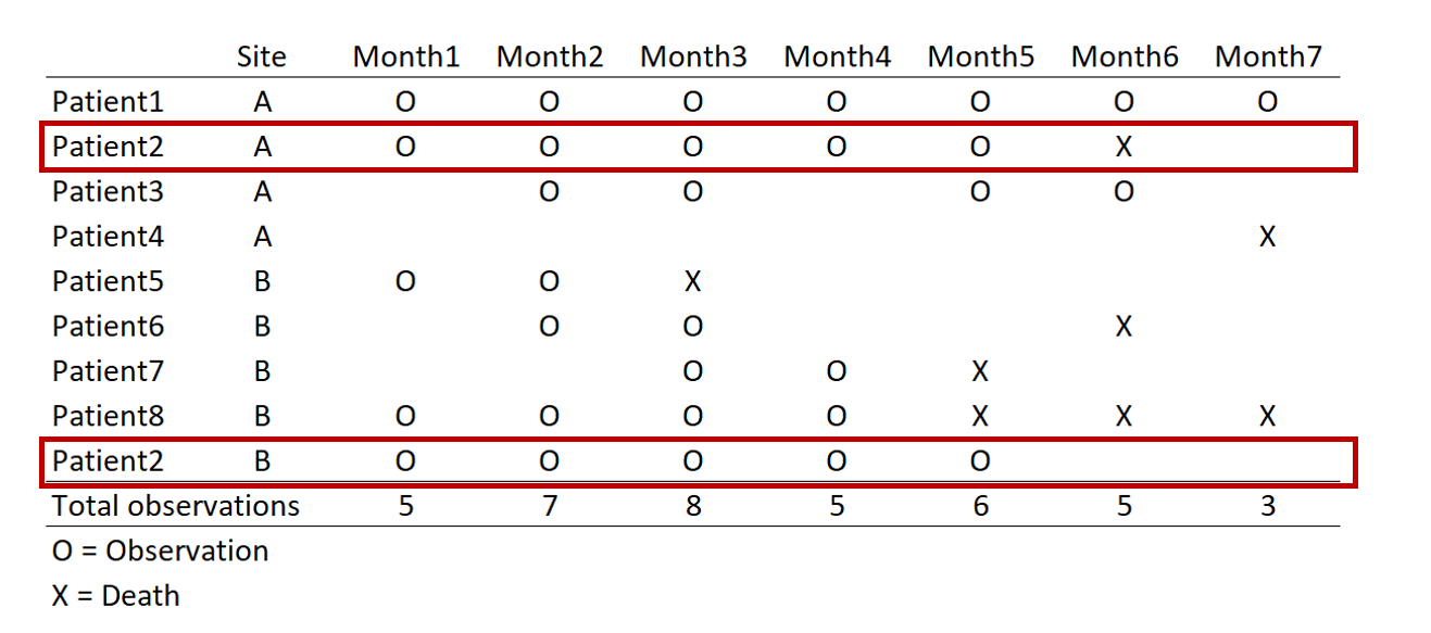
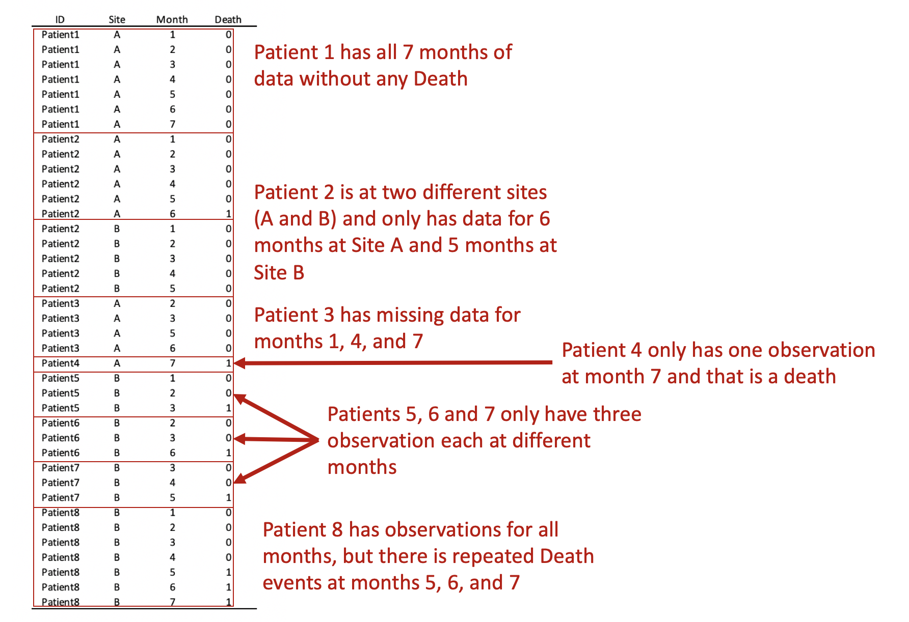
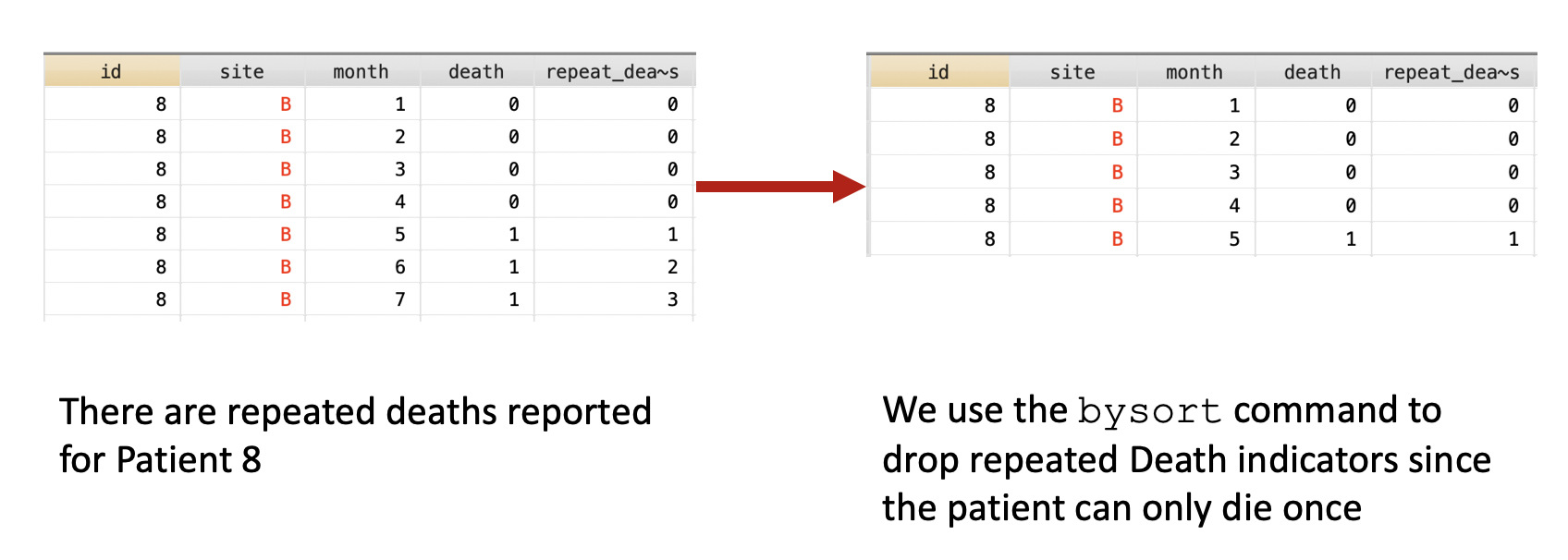
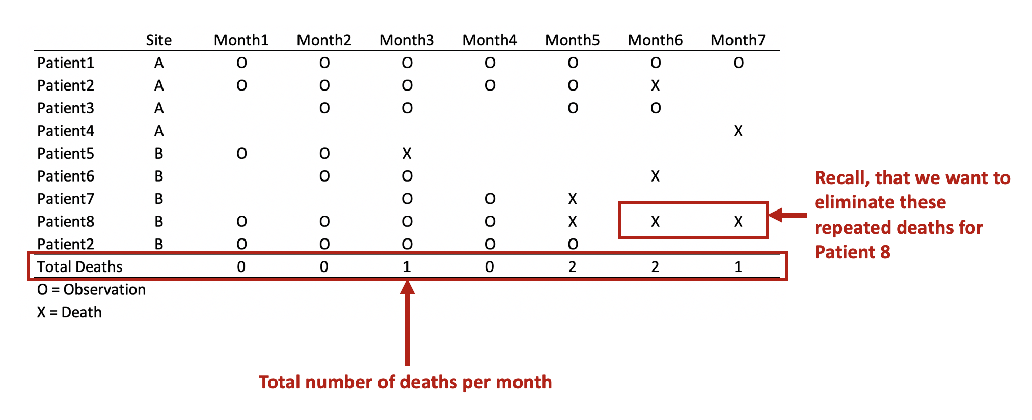
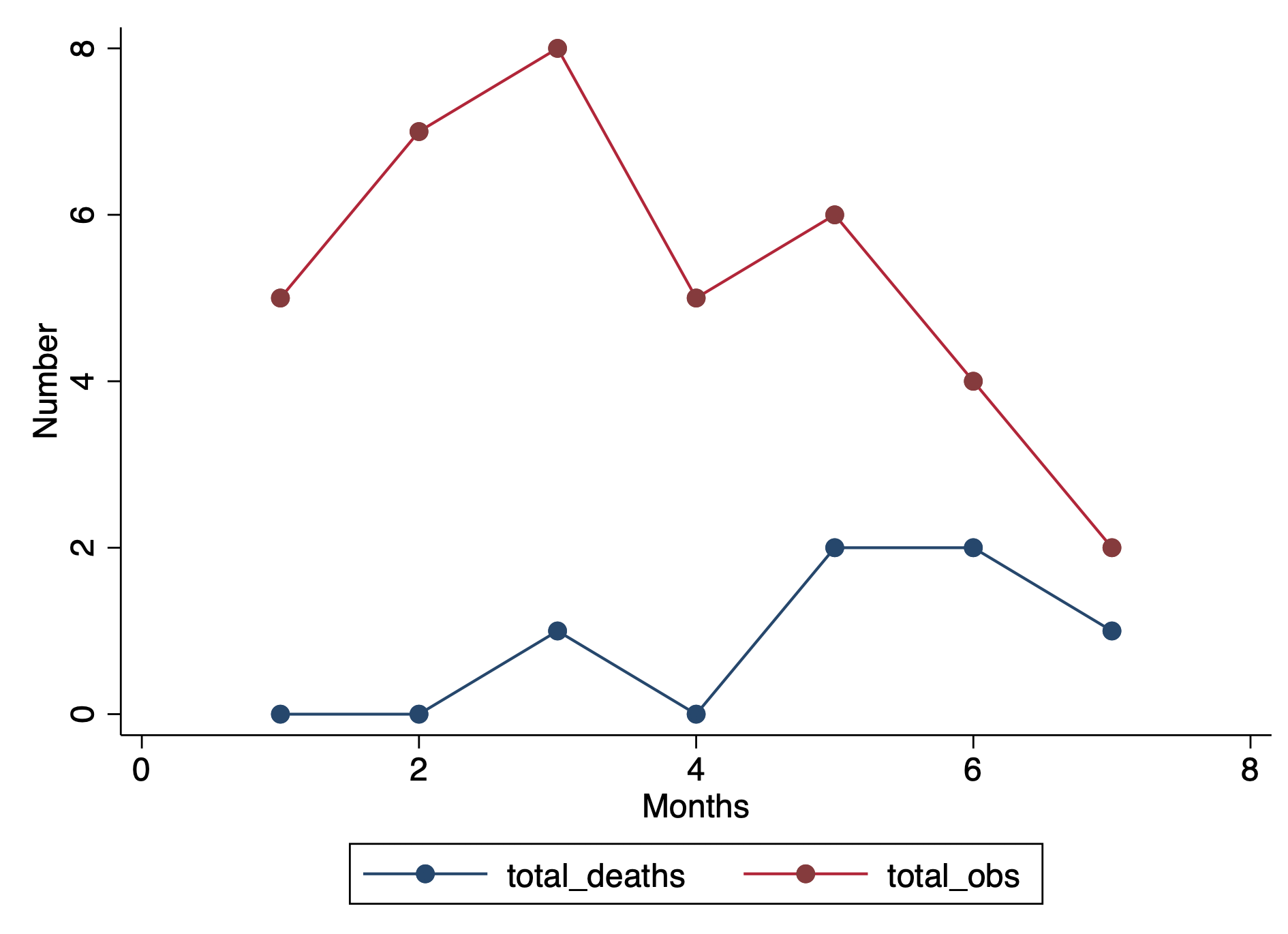
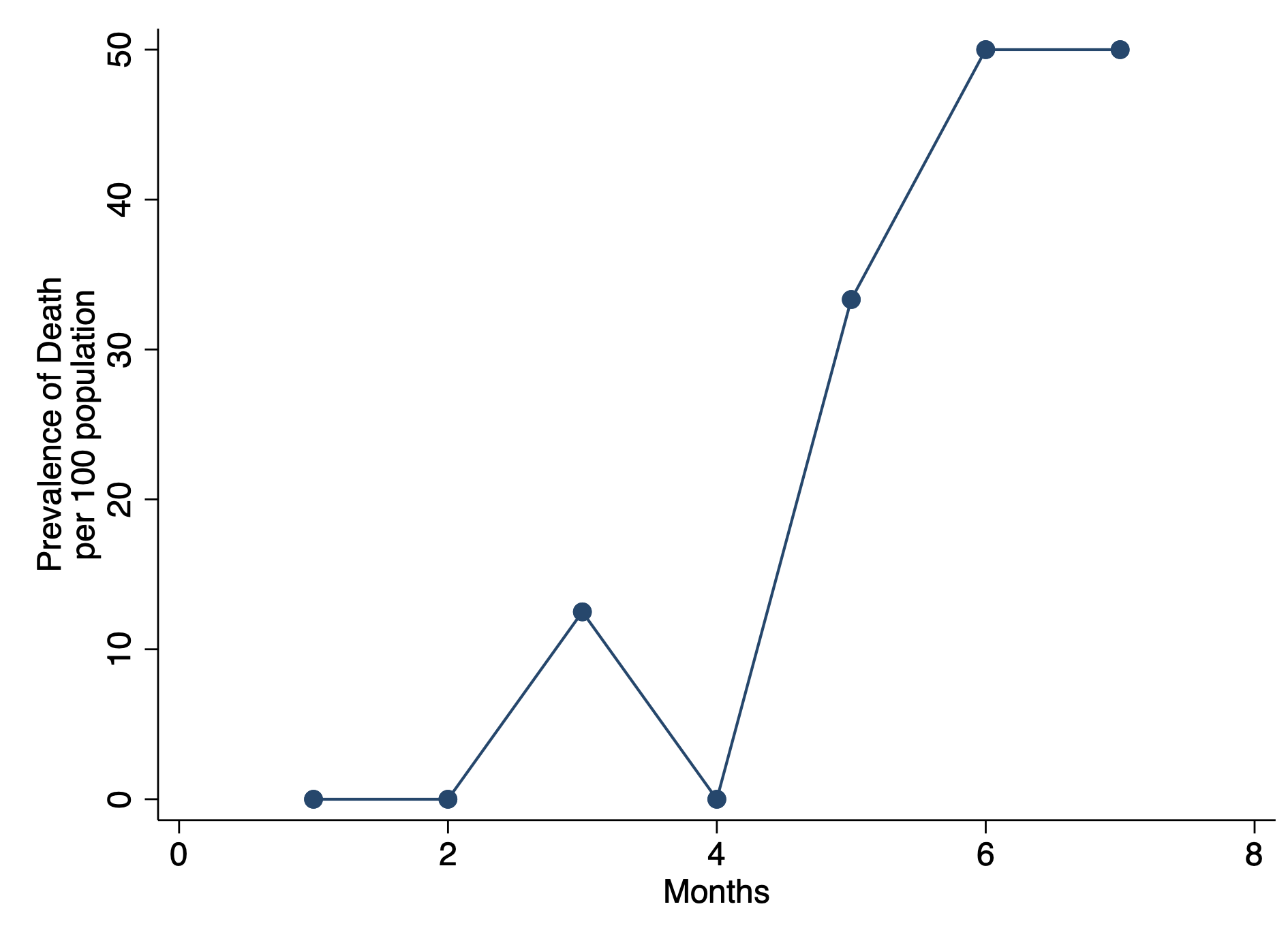
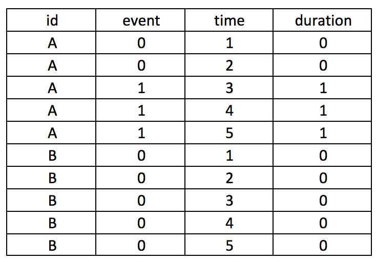
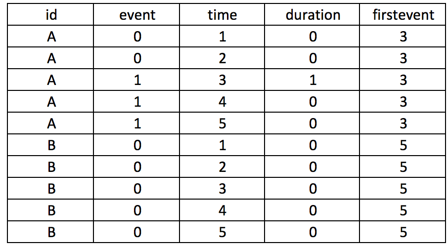
I wrote a tutorial on how to handle immortal time bias with survival analysis using Stata. In the tutorial, I used a time-varying predictor for the grouping variable and assigned the period before exposure to the control group. This was inspired by the paper Redelmeier and Singh wrote on “Surival in Academy Award-Winner Actors and Actresses.” There was a lot of debate about the rigor of their analyses, and Sylvestre and colleagues re-analyzed the data with immortal time bias in mind. This tutorial uses data from Sylvestre and colleagues to re-create their results.

The tutorial is on my RPubs page. Data used for the tutorial is located on my GitHub page.

To load the data, you can use the Stata import command

import delimited "https://raw.githubusercontent.com/mbounthavong/Survival-analysis-and-immortal-time-bias/main/Data/data1.csv"

Interrupted time series analysis (ITSA) with Stata

Interrupted time series analysis (ITSA) is a study design used to study the effects of an intervention across time. An important feature of the ITSA is the time when the intevention occurs. The time before and after the intervention are of interest because we want to visualize if the trends are similar or different. Additionally, we want to visualize the change immediately after the intervention is implemenated. I call this period the index date.

In this article, I’ll review the single-group ITSA and multiple groups ITSA. Then I’ll review how to perform an ITSA in Stata.

You can view the complete tutorial on my RPubs site.

Stata tutorial: Adding the 95% Confidence Interval to a Two-way Line Plot

I created a tutorial on how to add the 95% CI to a two-way line plot in Stata. I use the “connected” command to generate a line plot in Stata, and then I added the 95% CI to each value. Surprisingly, Stata does not have a native feature to allow users to generate these 95% CI on a two-way line plot.

I used the AHRQ Medical Expenditure Panel Survey (MEPS) database for the motivating example. In this tutorial, we plotted the average total healthcare expenditure from 2008 to 2019.

I build this tutorial on Stata, but I used R Markdown to write the tutorial. The R Markdown code is located in my GitHub site (Stata - Line plot with 95% CI tutorial).

You can find the tutorial on my Github site and RPubs page.

I used Stata SE 17 to build this.

Communicating data effectively with data visualizations—Part 18 (Histograms)

BACKGROUND

Inspecting your data is an important part of data analysis preparation. Data, like all things, should behave according to some reasonable expectation. For example, if we randomly sampled a group of people in the U.S., we would reasonably expect to get 50% males and 50% females. Similarly, if we examined the age distribution of this sample, we would expect to have a normal distribution.

At the macro level, we may only be interested if the mean and standard deviations are representative of the population distribution. Since we sample from the population (randomly), we would expect to get similar means (and medians). This can be accomplished using simple Excel functions (or commands in statistical packages) to generate a descriptive summary. Table 1 describes the summary statistics for the total fat consumed by a sample of 8,327 responders to the National Health and Nutrition Examination Survey (NHANES) survey.

TABLE 1.png

We can see that the mean and the median are different, which is an indicator that the distribution is not normal. However, we may be interested in learning more about the distribution or behavior of this variable. Are there any outliers? How skewed is the distribution?

HISTOGRAMS

To visualize this, we will need to generate a histogram. A histogram is a visual representation (bars) of the distribution of data (usually continuous). It uses spacings called “bins” to count the number of times a value falls into that bin. A histogram looks like a bar chart, but the key difference is that in the histogram the adjacent bars are touching each other rather than having a space between them. Another difference is that histograms plot the frequency (or density) of a value or a range of values for a continuous data type; whereas, bar charts plot the count of a discrete data type (Figure 1).

Figure 1. Comparisons between histogram and bar chart.

Keep in mind that the number of bins for histograms should be just enough to make out the distribution and not too small to be too much information. This is Grice’s maxim of quantity where data are presented in an informative manner without overwhelming the audience with too much information.[1] Creating smaller bins to increase the resolution of the histogram is unnecessary when all you want is a general visualization of the data’s distribution.


MOTIVATING EXAMPLE

We will use data from the NHANES survey (2015-2016) to generate a histogram in Excel. The data can be downloaded from my Dropbox folder here. I cleaned the file so that all missing data were dropped. In total, there are three variables:

·      seqn = subject identifier

·      drqsdiet = special diet (Yes/No/Don’t know)

·      dr1ttfat = amount of total fat (gm) consumed

We will create a histogram to visualize the distribution of total fat consumed by the subjects. To start, let’s select the data and insert a histogram chart from the Insert Tab.

A histogram will be inserted near where your data are located on the worksheet. Excel automatically selects the bin sizes for you. But you can customize this to your needs.

Figure 3 -histogram.png

Right click anywhere x-axis and select Format Axis. You should see a column on the right side appear with options to modify the bin sizes.

You can modify the bin width, number of bins, the overflow bin, and underflow bin.

The bin width can be larger or smaller depending on how much resolution you want. You should balance this out with the appropriate number of bins you want to show. According Grice’s maxim of quantity, you don’t want to overwhelm your audience. In Excel, you can only modify either the bin width or the number of bins; never both.

The overflow bin indicates what the last bin should be. If anything is over the overflow bin value (X), then Excel will collapse those frequencies into that last bin. For example, if I wanted the overflow bin to be 137 grams or greater, I enter “137” into the overflow bin field. You can do the same thing on the other end of the x-axis with the underflow bin value.

Once you’ve figure out how to change the number of bins, let’s change the number of bins from 66 to 100, 75, 50, and 25 to observe how the histogram changes.

Notice that the histogram with a bin size of 100 is really fine whereas the bin size of 25 is blocky. We can tell from all of these figures that there is a right skew to the distribution due to a few outliers. There are 3 subjects who consume more than 400 grams of total fat compared to 19 subjects who consume between 300 and 399 grams of total fat. The higher resolution doesn’t really help us determine that the total fat consumption is right skewed compared to the figures with bin sizes of 75 and 50. If I were presenting to an audience or publishing an appendix, I would select either the figure with a bin size of 75 or 50. These two histograms illustrate the peak at the mean and the right-skewed distribution without violating Grice’s maxim of quantity. However, different situations will require you to make different choices, so I encourage you to explore the design features on Excels’ histogram.

STEM-AND-LEAF HISTOGRAM

The stem-and-leaf display is an alternative histogram that uses the prefix of number to assign positions into the bins. The following figure is a randomly selected number of subjects from our NHANES data. The first subject consumed 14 grams of total fat which is indicated by the 1* | 4. The 1* represents the first digit of “14” and the “|” separates the next digit. Similarly, there is one subject who consumed 22 grams of total fat indicated by the 2* | 2 and another subject consumed 24 grams of total fat (2* | 4).

 
Figure 7 - stem-and-leaf.png
 

CONCLUSIONS

Histograms are a great visualization tool to quickly check whether your continuous data are normally distributed. You can identify whether the mean is close to the median or whether there are left or right skewness to your data. Moreover, you can change the bin sizes of a histogram to become more refined or less so. But according to Grice’s maxim of quantity, it is best to present enough data that will get the information across to your audience without overwhelming them with unnecessary details.


REFERENCES

Grice, H. P. Logic and Conversation.  In Cole P. and Morgan J. (Eds), Syntax and Semantics: Vol 3, Speech Acts. Academic Press, New York, pp.43-58, 1975.

Using Stata’s bysort command for panel data in time series analysis

BACKGROUND

Sorting information in panel data is crucial for time series analysis. For example, sorting by the time for time series analysis requires you to use the sort or bysort command to ensure that the panel is ordered correctly. However, when it comes to panel data where you may have to distinguish a patient located at two different sites or a patient with multiple events (e.g., deaths), it’s important to organize the data properly.

You can download the sample data and Stata code at the following links:

Data

Code


MOTIVATING EXAMPLE

In this example, we have a data set with time (months) in the column and patients in the rows (this is called a wide format data set). For each month, there are different numbers of observations. For instance, in Month 1, there were 5 observations. But in Month 7 there were only three.

The highlighted boxes indicate a patient was observed at two different sites. There are two ways to approach this: (1) remove the patient from Site B or (2) keep the patient by distinguishing it at each sight. Removing the patient will result in a loss of information for Site B, but keeping the patient complicates the panel data when we convert from wide to long format.

Figure 1.png

Converting this from wide to long format would result in the following panel data. Review each patient, in particular, the months of observations reported for the months. Notice that not all patients have observations for all the months (Months 1 to 7). Some patients have observations for scattered months (e.g., Patient 3). Of note is Patient 2 who has observations at Sites A and B. Since we opted to keep Patient 2 data for Sites A and B, we need to distinguish a method to ensure that the panel data is ordered correctly. Interestingly, Patient 8 has an observed event  (Death) three times at Months 5, 6, and 7. Since a patient should experience death only once, this may be a coding error and should be removed. Using the Stata sort and bysort command will allow us to fix this problem.

Figure 2.png

The bysort command has the following syntax:

bysort varlist1 (varlist2): stata_cmd

Stata orders the data according to varlist1 and varlist2, but the stata_cmd only acts upon the values in varlist1. This is a handy way to make sure that your ordering involves multiple variables, but Stata will only perform the command on the first set of variables.


REMOVE REPEATED DEATHS FROM PATIENT 8

First, we want to make sure we eliminate the repeated deaths from Patient 8. We can do this using the bysort command and summing the values of Death. Since Death == 1, we can sum up the total Deaths a patient experiences and drop those values that are greater than 1—because a patient can only die once.

***** Identify patients with repated death events. 
bysort id site (month death): gen byte repeat_deaths = sum(death==1)
drop if repeat_deaths > 1 

The alternative methods use the sort command:

* Alternative Method 1:
by id site (month death), sort: gen byte repeat_deaths = sum(death==1)
drop if repeat_deaths > 1

* Alternative Method 2:
sort id site (month death)
by id site (month death): gen byte repeat_deaths = sum(death ==1)
drop if repeat_deaths > 1
Figure 3.png

Now we have a data set without the unnecessary death values for Patient 8. Therefore, Patient 8 will not be counted in months 6 and 7 because they are no longer contributing to the denominator.


COUNT THE NUMBER OF DEATHS PER MONTH

Suppose we want to perform a single group time series analysis. We would want to sum up the number of deaths across the months. We can do this using the bysort command.

First, we have to think about how we want to count death. Since Death == 1, we want to add up the number of Death for each month. Initially, we were worried that Death would be counted two more times for Patient 8, but we solved this problem by removing these events from Patient 8.

Figure 4.png

The following command will yield the above results in a long format.

bysort month: egen byte total_deaths = total(death)

We use the egen command because we are using a more complex function. Detailers on when to use gen versus the egen commands are located at this site.


DETERMINING THE DENOMINATOR—COUNTING THE NUMBER OF PATIENTS CONTRIBUTION INFORMATION

Next, we want to determine that number of patient observations that are contributed to each month. To do this, we can use the bysort command again.

***** Determine the denominator -- using bysort and counter variable
gen counter = 1
bysort month: egen byte total_obs = total(counter)

This should yield the following results:

Figure 5.png

CHANGING FROM PATIENT-LEVEL DATA TO SINGLE-GROUP DATA

Currently, the data is set up using the patient-level. We want to change this to the single-group level or the aggregate monthly level. To do this, we have to eliminate the repeated month measurements for our total deaths (numerator) and total observations (denominator).

***** Drop duplicate months
bysort month: gen dup = cond(_N==1, 0, _n)
drop if dup > 1

We can visualize this by plotting two separated lines connected at the values for each month.

****** Plot the total number of deaths and total number of observations
graph twoway (connected total_deaths month, lcol(navy)) ///
             (connected total_obs month, lcol(cranberry) ytitle("Number") ///
	      xtitle("Months") ylab(, nogrid) graphregion(color(white)))
Figure 6.png

We can take this a step further and calculate the prevalence.

***** Estimate the prevalence (per 100 population) and plot
gen prev = (total_deaths / total_obs ) * 100	

graph twoway connected prev month, ytitle("Prevalence of Death" "per 100 population") ///
	     xtitle("Months") ylab(, nogrid) graphregion(color(white))
Figure 7.png

CONCLUSIONS

Using the bysort command can help us fix a variety of data issues with time series analysis. In this example, we have patient-level data that contained deaths for one patient and a patient who was observed at different sites. Using the bysort command to distinguish between sites allowed us to properly identify the patient as unique to the site. Additionally, we used the bysort to identify the patient with multiple deaths and eliminated these values from the aggregate monthly values. Then we finalized out single-group data set by summing the total deaths and observations per month and removing the duplicates.

You can download the Stata code from my Github site.


REFERENCES

I used the following references to write this blog.

Stata commands: bysort:

https://stats.idre.ucla.edu/stata/faq/can-i-do-by-and-sort-in-one-command/


Stata commands: gen versus egen:

https://stats.idre.ucla.edu/stata/seminars/notes/stata-class-notesmodifying-data/

Counting and Data Manipulation for an ITSA

BACKGROUND

In time series analysis, we are interested on the impact of some exposure over a time period. Exposure can be coded as event==1. If this is time-varying, then the event can occur at any time across a time period. Time series analysis requires us to identify the time when the event first occurred. In most cases this is also considered the post period. In this example, we will label the exposure of interest as event.

Longitudinal data can come in either a wide or long format. However, it is easier to perform longitudinal data analysis in the long format. This assumes that you declare either the xtset or tsset as a panel or time-series data set, respectively.

MOTIVATING EXAMPLE

Let’s assume that we have two subjects (A and B), who can experience an event at any time between some time variable 1 and 5, time(1:5). This is a longitudinal data set in the long format with id as the unique subject-level identifier, the exposure variable of interest event as the exposure, and time as an arbitrary time variable ranging from 1 to 5. The event for subject A occurs at time==3.

Screen Shot 2018-02-18 at 3.13.23 PM.png

Suppose you want to create a variable that counts the number of times the subject has the event. We will call this variable duration.

Screen Shot 2018-02-18 at 3.14.35 PM.png

The following Stata code will generate the duration variable.

by id (time), sort: gen byte duration = sum(event==1)

Sorting by the id and then time will nest the time sequence for each id. The sum() will add all event that is coded as 1.

It’s critical that you put time in parentheses (); otherwise, you can generate incorrect values. For instance, if you make the mistake of typing the Stata code as follows, you will generate a dataset which doesn’t provide the cumulative duration of having the event. Notice how the duration variable only has 1 instead of 1, 2, and 3.

by id time, sort: gen byte duration = sum(event==1)
Screen Shot 2018-02-18 at 3.17.26 PM.png

Similarly, if you use the following code, you will generate the incorrect values. The sum(event)==1 syntax should be sum(event==1). However, this will “flag” the time when the event first occurred, which may be useful in some cases. 

by id (time), sort: gen byte duration = sum(event)==1
Screen Shot 2018-02-18 at 3.18.48 PM.png

Let’s take our example further and generate a variable column that takes into consideration the period before the subject experiences an event. Suppose subject A experiences an event at time==3, but we want to center this as 0 and previous months as -1, -2, and so on. We need to first identify the time when the event occurs and populate that as a new variable, which we will call firstevent. We can use the following State code to generate firstevent based on the condition that the event==1 and the variable it occurs is time==3.

egen firstevent = min(cond(event == 1, time, .)), by(id)
Screen Shot 2018-02-18 at 3.19.41 PM.png

There will be missing values since not all subjects experience the event. To populate the missing values for the subjects with no events (event==0), we need to replace firstevent by identifying the max time of the entire study period using the summary command. Once we have the max time of the study period, we add 1 to this and replace the missing values from the firstevent variable.

replace firstevent = max(time) if firstevent == .
summ time
global maxtime = r(max)

replace firstevent = $maxtime + 1 if firstevent == .
Screen Shot 2018-02-18 at 3.20.31 PM.png

We can subtract the time from the first event to generate a new variable (its) that will capture the negative time before the event occurs and the positive time after the event occurs, centered on when event==1.

by id (time), sort: gen byte its = _n – firstevent
Screen Shot 2018-02-18 at 3.21.29 PM.png

The new variable its is short for interrupted time series analysis. An investigator can use the its variable to plan any interrupted times series analysis without having to go through the ordeal of generating this variable using other software.

Here is a summary of the entire Stata code, which you can also find on my Github page:

***** Declare XTSET panel dataset.
* Variable list: id event time 
* id        =   subject identifier
* event     =   exposure of interest
* time      =   time interval

**** Create the duration variable to capture time after event.
by id (time), sort: gen byte duration = sum(event==1)

**** Create a variable for the time before the event.
egen firstevent = min(cond(event == 1, time, .)), by(id)

**** Identify the maxtime.
summ time
global maxtime = r(max)

**** Replace missing data with the maxtime + 1.
replace firstevent = $maxtime + 1 if firstevent == .

**** Create its to capture time before and after event. 
by id (time), sort: gen byte its = _n - firstevent

ACKNOWLEDGEMENTS

I used several online references to develop this tutorial for Stata. Nicholas J. Cox has some excellent tutorials that was influential in developing this piece.

Cox N. First and last occurrences in panel data. From https://www.stata.com/support/faqs/data-management/first-and-last-occurrences/

The Statlist forum was also helpful; in particular, the following discussion threads.

https://www.statalist.org/forums/forum/general-stata-discussion/general/965910-how-generate-variable-that-indicates-current-and-prior-event-occurrence-for-id-in-panel-data

https://www.statalist.org/forums/forum/general-stata-discussion/general/1297707-creating-duration-variable-for-panel-data

https://www.stata.com/statalist/archive/2010-12/msg00193.html

https://www.stata.com/statalist/archive/2012-09/msg00286.html

The UCLA Institute for Digital Research and Education has a tutorial on using _N and _n to count in Stata.

Counting from _N to _N. UCLA: Statistical Consulting Group. From https://stats.idre.ucla.edu/stata/seminars/notes/counting-from-_n-to-_n/