BACKGROUND
Sorting information in panel data is crucial for time series analysis. For example, sorting by the time for time series analysis requires you to use the sort or bysort command to ensure that the panel is ordered correctly. However, when it comes to panel data where you may have to distinguish a patient located at two different sites or a patient with multiple events (e.g., deaths), it’s important to organize the data properly.
You can download the sample data and Stata code at the following links:
MOTIVATING EXAMPLE
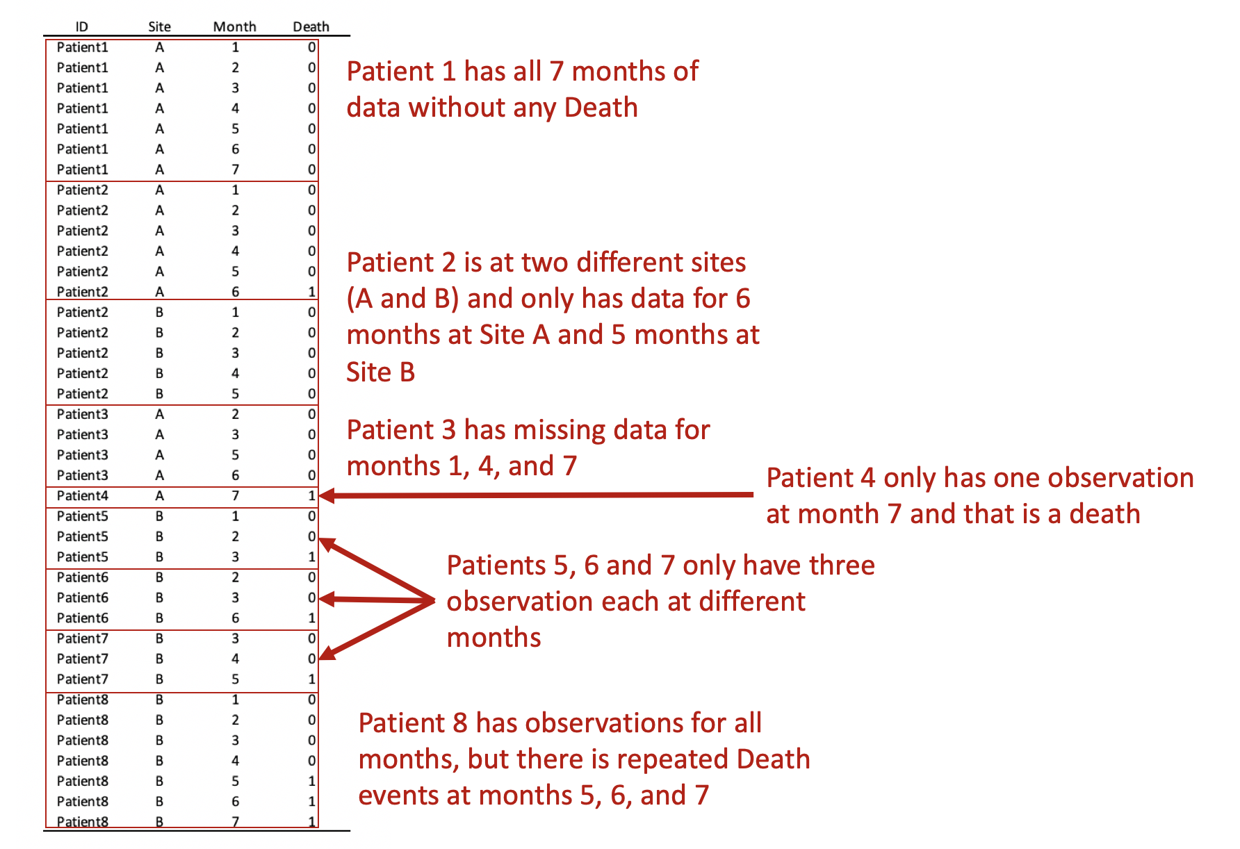
In this example, we have a data set with time (months) in the column and patients in the rows (this is called a wide format data set). For each month, there are different numbers of observations. For instance, in Month 1, there were 5 observations. But in Month 7 there were only three.
The highlighted boxes indicate a patient was observed at two different sites. There are two ways to approach this: (1) remove the patient from Site B or (2) keep the patient by distinguishing it at each sight. Removing the patient will result in a loss of information for Site B, but keeping the patient complicates the panel data when we convert from wide to long format.
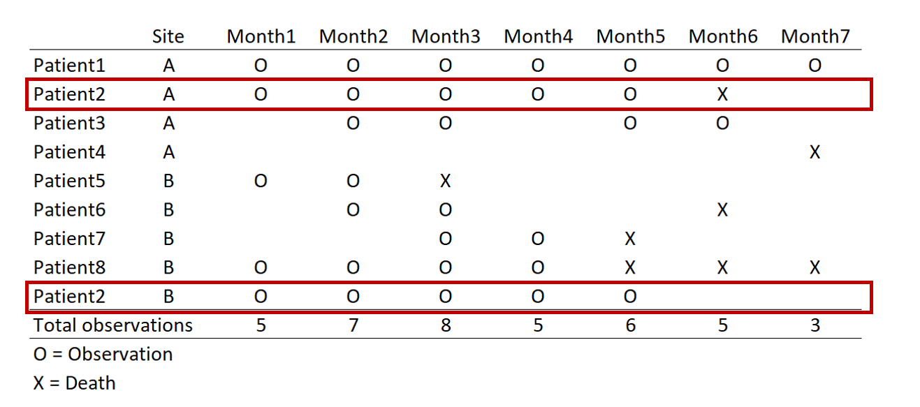
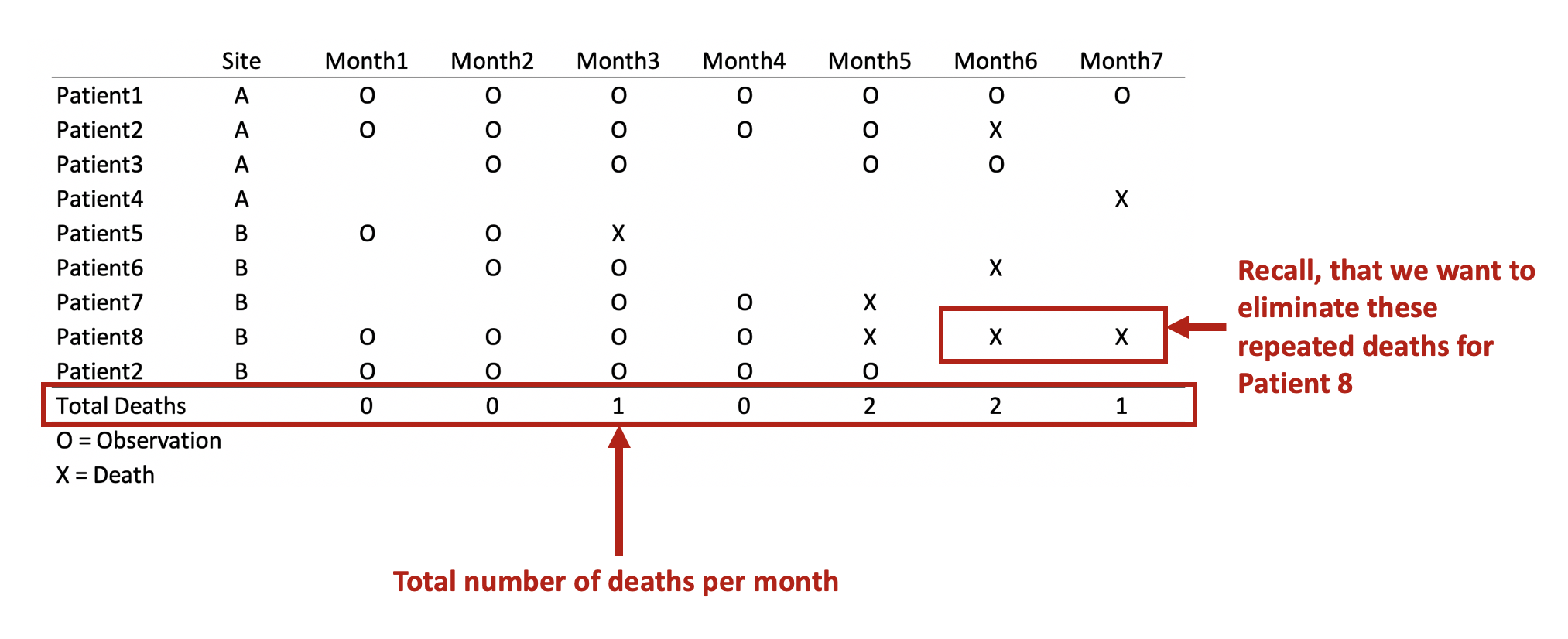
Converting this from wide to long format would result in the following panel data. Review each patient, in particular, the months of observations reported for the months. Notice that not all patients have observations for all the months (Months 1 to 7). Some patients have observations for scattered months (e.g., Patient 3). Of note is Patient 2 who has observations at Sites A and B. Since we opted to keep Patient 2 data for Sites A and B, we need to distinguish a method to ensure that the panel data is ordered correctly. Interestingly, Patient 8 has an observed event (Death) three times at Months 5, 6, and 7. Since a patient should experience death only once, this may be a coding error and should be removed. Using the Stata sort and bysort command will allow us to fix this problem.
The bysort command has the following syntax:
bysort varlist1 (varlist2): stata_cmdStata orders the data according to varlist1 and varlist2, but the stata_cmd only acts upon the values in varlist1. This is a handy way to make sure that your ordering involves multiple variables, but Stata will only perform the command on the first set of variables.
REMOVE REPEATED DEATHS FROM PATIENT 8
First, we want to make sure we eliminate the repeated deaths from Patient 8. We can do this using the bysort command and summing the values of Death. Since Death == 1, we can sum up the total Deaths a patient experiences and drop those values that are greater than 1—because a patient can only die once.
***** Identify patients with repated death events.
bysort id site (month death): gen byte repeat_deaths = sum(death==1)
drop if repeat_deaths > 1
The alternative methods use the sort command:
* Alternative Method 1:
by id site (month death), sort: gen byte repeat_deaths = sum(death==1)
drop if repeat_deaths > 1

* Alternative Method 2:
sort id site (month death)
by id site (month death): gen byte repeat_deaths = sum(death ==1)
drop if repeat_deaths > 1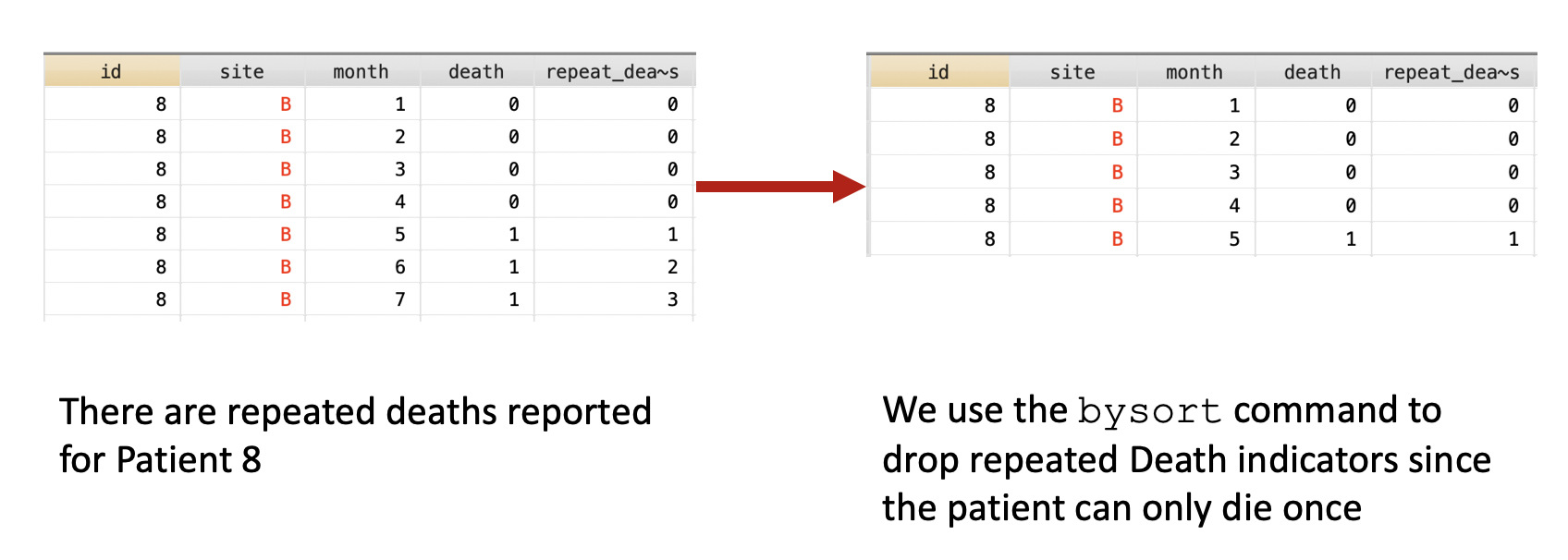
Now we have a data set without the unnecessary death values for Patient 8. Therefore, Patient 8 will not be counted in months 6 and 7 because they are no longer contributing to the denominator.
COUNT THE NUMBER OF DEATHS PER MONTH
Suppose we want to perform a single group time series analysis. We would want to sum up the number of deaths across the months. We can do this using the bysort command.
First, we have to think about how we want to count death. Since Death == 1, we want to add up the number of Death for each month. Initially, we were worried that Death would be counted two more times for Patient 8, but we solved this problem by removing these events from Patient 8.
The following command will yield the above results in a long format.
bysort month: egen byte total_deaths = total(death)We use the egen command because we are using a more complex function. Detailers on when to use gen versus the egen commands are located at this site.
DETERMINING THE DENOMINATOR—COUNTING THE NUMBER OF PATIENTS CONTRIBUTION INFORMATION
Next, we want to determine that number of patient observations that are contributed to each month. To do this, we can use the bysort command again.
***** Determine the denominator -- using bysort and counter variable
gen counter = 1
bysort month: egen byte total_obs = total(counter)
This should yield the following results:

CHANGING FROM PATIENT-LEVEL DATA TO SINGLE-GROUP DATA
Currently, the data is set up using the patient-level. We want to change this to the single-group level or the aggregate monthly level. To do this, we have to eliminate the repeated month measurements for our total deaths (numerator) and total observations (denominator).
***** Drop duplicate months
bysort month: gen dup = cond(_N==1, 0, _n)
drop if dup > 1
We can visualize this by plotting two separated lines connected at the values for each month.
****** Plot the total number of deaths and total number of observations
graph twoway (connected total_deaths month, lcol(navy)) ///
             (connected total_obs month, lcol(cranberry) ytitle("Number") ///
	      xtitle("Months") ylab(, nogrid) graphregion(color(white)))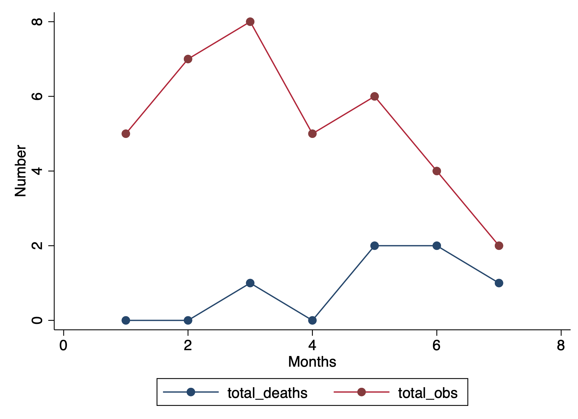
We can take this a step further and calculate the prevalence.
***** Estimate the prevalence (per 100 population) and plot
gen prev = (total_deaths / total_obs ) * 100

graph twoway connected prev month, ytitle("Prevalence of Death" "per 100 population") ///
	     xtitle("Months") ylab(, nogrid) graphregion(color(white))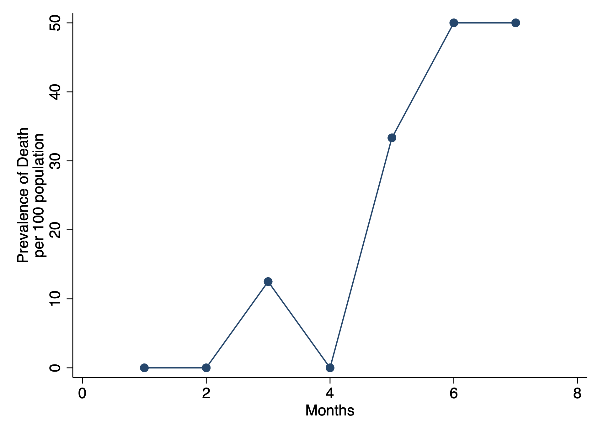
CONCLUSIONS
Using the bysort command can help us fix a variety of data issues with time series analysis. In this example, we have patient-level data that contained deaths for one patient and a patient who was observed at different sites. Using the bysort command to distinguish between sites allowed us to properly identify the patient as unique to the site. Additionally, we used the bysort to identify the patient with multiple deaths and eliminated these values from the aggregate monthly values. Then we finalized out single-group data set by summing the total deaths and observations per month and removing the duplicates.
You can download the Stata code from my Github site.
REFERENCES
I used the following references to write this blog.
Stata commands: bysort:
https://stats.idre.ucla.edu/stata/faq/can-i-do-by-and-sort-in-one-command/
Stata commands: gen versus egen:
https://stats.idre.ucla.edu/stata/seminars/notes/stata-class-notesmodifying-data/