BACKGROUND
Changes in data values happens. But when you want to visualize these changes, you need to choose the visualization that best explains the narrative. In this article, we will explore the use of waterfall charts, which are a form of data visualization that illustrates changes from the reference value across some sequentially ordered axis (e.g., time).
MOTIVATING EXAMPLE
I created a dataset where the average duration of an academic detailing educational outreach visit was estimated from Quarter 1 Fiscal Year 2017 (Q1 FY17) to Quarter 4 Fiscal Year 2018 (Q4 FY18). The initial dataset includes the reference (or base) average duration (in minutes) of an academic detailing educational outreach visit followed by positive and negative changes to the reference value. (Excel example can be retrieved from the following link.)
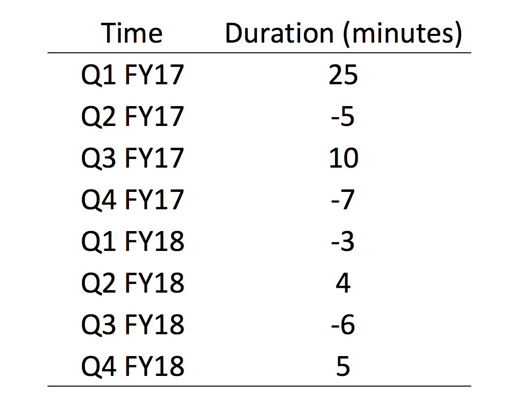
There are a few things to consider when reviewing this table. The reference value is 25 minutes, which was the average duration in Q1 FY17. However, in Q2 FY17, the average duration decreased by 5 minutes for a new value of 20 minutes. Then in Q3 FY17, the average duration increased by 15 minutes for a net gain of 10 minutes from the reference value of 25 minutes (25 + 10).

Understanding how these values reflect the net gain from the reference value is critical in building the waterfall chart.
TUTORIAL
Step 1: Create three new columns (base, fall, and rise)
We need to do some calculations to generate the base values for the waterfall chart.
Start by creating three additional columns and label them as base, fall, and rise (I learned how to design my table from this YouTube video by United Computers).

Step 2: Estimate the value for the fall column
For the fall column, we want to look at the Duration column. If the value in the Duration column is positive, then we need to have the value in the “fall” column as zero. If the value in the Duration column is negative, when we want the absolute (positive) value in the “fall” column.
Here is an illustration of what the “fall” column calculation requires.

Step 2: Estimate the value for the rise column
To estimate the rise column we, again, look to the Duration column. If the value in the Duration column is positive, we enter it into the “rise” column. If the value in the Duration column is negative, then we enter 0 in the “rise” column.
Here is an illustration of what the “rise” column calculation requires.

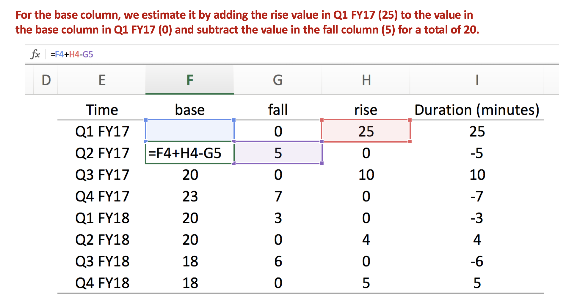
Step 3: Estimate the value for the base column
The base column provides the necessary reference for us to create the waterfall chart. Unlike the other columns, we start in the base column Q2 FY17 row since the “base” column value in Q1 FY17 is the reference. Then we add the “rise” column in Q1 FY17 and subtract the “fall” column in Q2 FY17. We do this for all the remaining cells.
Here is an illustration of what the “base” column calculation requires.
Step 4: Review the final data
The final data should look like the following.

Step 5: Create a stacked bar chart
Select the data from the Time, base, fall, and rise columns and then insert a stacked bar chart.

You should have a chart that looks like the following.

Step 6: Hide the base stacked bars
The next step is to hide the base column values by selecting the blue bars and changing the formatting to No Fill and No Line.

Step 7: Format the chart for final presentation
You should format the chart using colors that indicate the direction of the rise and fall in the average duration of educational outreach visits. I selected blue for an increase and red for a decrease. I also added the Y-axis label and decreased the gap width to 10%.
Final waterfall chart

CONCLUSIONS
The waterfall chart visualizes the rise and fall in average duration of an academic detailing visit across two fiscal years. This visualization provides the viewer with an intuitive summary of the changes that occurred and whether action plans are needed. From this example, we notice that the changes did not deviate from the base of 25 minutes per visit across two fiscal years. Therefore, there may not be a need to spend resources to investigate this element of academic detailing.
In this example, I re-created the waterfall chart to illustrate seasonal changes.

Like the previous waterfall chart, this is a clear and intuitive visualization of the changes that occurred across two fiscal years. The red bars easily illustrate that the average duration decreased immediately after Q1 FY17, but increased after Q1 FY18 only to follow the same pattern as the previous fiscal year. This tells us that something is going on during Q1 of each fiscal year, which may require some kind of investigation of the program at the beginning of each fiscal year.
Microsoft Office 365 for Windows and Microsoft Office 2016 for the Mac have a new feature for creating waterfall charts. You may need to check the Office Updates to acquire these new features.

You can learn about these in the following Microsoft Office sites (link 1, link 2)
REFERENCES
I used the following YouTube video by United Computers to help generate the waterfall charts in this article.
I also referred to Cole N. Knaflic’s blog on waterfall charts.